다음에 대한 결과:
- If you have the app's handle, use delete(app) or close(app,'force'). This will also work on the app's figure handle.
- If you do not have the app's handle, you can use close('all','force') to close all figures or use findall(groot,'type','figure') to find the app's figure handle.
.
MATLAB R2022a provides app developers more control over user navigation through app components using the keyboard's Tab key.
Part 1. The new focus function: programmatically set keyboard focus to a UI component
Part 2. Modify focus order of components
Today we'll review Part 2. See yesterday's Community Highlight for Part 1.
-------------------------------------------------------------------------------------------------
Well-designed apps have an obvious flow through interactive fields and, as we learned yesterday, using the Tab key to move the focus to the next UI component is faster and more efficient than using a mouse. Here we'll learn how to read and set the tab order of UI components in an app.
Understanding tab and stacking order
By default, tab order in MATLAB apps is controlled by the stacking order in the Component Browser. Initially, the stacking order within the component browswer is based on the sequence in which the objects were added to the container object within the app. MATLAB R2020b gave us control to edit the stacking order by selecting a component and using either the Reorder tool from the Canvas toolstrip or by right-clicking the component and selecting Reorder from the context menu [1]. Tab order flows from bottom to top through the Component Browswer hierarchy for objects that are focusable. Sending a component backward within the stack sets its tab order to earlier relative to other components.
Setting tab focus order in R2022a
Three additional tab order features were added in MATLAB R2022a that make it easier to control app navigation with the Tab key.
1. Sort and Filter by Tab Order : Instead of using the Reorder tool which lists components in reverse tab-order and includes components that are not focusable, filter the list by focusable components and sort them by tab-order using the View dropdown menu within the Component Browser (label 1 in image below). From here, you can drag and drop components to set their tab (and stacking) order.
2. Auto Tab Order : To automatically sort focusable components within your app so that the tab order is from left-to-right and then top-to-bottom, in App Designer, from Design View, select the Canvas tab > Tab Order button > Apply Auto Tab Order (label 2 in image below). Alternatively, you can apply auto tab order to components within a container such as a uipanel or uitab by right-clicking on the container within the Component Browser and selecting Apply Auto Tab Order.
3. Visualize Tab Order : You no longer have to read and interpret the handle names in the component browser to understand the current tab order of UI components. Instead, view an animation of tab order within App Designer. From Design View, select the Canvas tab > Tab Order button > Visualize Tab Order (label 3 in image below).
.
Contextual focus control: the power of combining focus() with setting tab order
Yesterday's Community Highlight showed how to programmatically set UI component focus using the focus(c) function. This, combined with control of tab order, allows app developers to implement contextual focus control. For example, when a radio button is selected in the GIF below, the corresponding UI Tab is selected programmatically and the keyboard focus is set to the first component within the UI Tab thus allowing the user to smoothly continue keyboard navigation. This is achieved by a callback function that responds to changes in the Button Group that sets the SelectedTab property of the TabGroup and uses the new focus() function. For details, see the attached focusAndTabOrderDemo.mlapp.
-------------------------------------------------------------------------------------------------
Stay tuned
Follow Community Highlights to get notifications for new content.
Let us know what interests you in the new MATLAB R2022a release in the comment section below.
See also
- MATLAB documentation: Modify Tab Focus Order of Components
- Release notes: Modify tab focus order
- R2021a Highlight: keyboard shortcuts for UI Components
- Download the latest release of MATLAB
Footnotes
[1] R202b release notes: change the stacking order of UI components
This Community Highlight is attached as a live script.
.
MATLAB R2022a provides app developers more control over user navigation through app components using the keyboard's Tab key.
Part 1. The new focus function: programmatically set keyboard focus to a UI component
Part 2. Modify focus order of components
Today we'll review Part 1. Come back tomorrow for Part 2.
-------------------------------------------------------------------------------------------------
Programmatically set UI component focus
Did you know that you can save ~2 seconds every time you use a keyboard shortcut rather than reaching for your mouse [1,2]?
I need you to focus here: starting in MATLAB R2022a, use the new focus function to set keyboard focus to a specific UI component.
By specifying the component handle ( c ) in focus(c),
- The figure containing the component is displayed
- A blue frame appears around the component
- The user can directly interact with the component.
.
Which components are focusable?
Focusable components are those that a user can interact with using the keyboard. So an object set to Enable='off' or Visible='off' cannot be in focus. See the documentation for more details.
What will you do with all of that extra time saved?
-------------------------------------------------------------------------------------------------
Stay tuned
Tomorrow we'll learn how to apply the new focus function with control of tab order to create contextual flow of UI component focus. Follow Community Highlights to get notifications.
Let us know what interests you in the new MATLAB R2022a release in the comment section below.
See also
- Release notes: focus
- R2021a Highlight: keyboard shortcuts for UI Components
- Download the latest release of MATLAB
Footnotes
[1] Lane et. al. (2005). International Journal of Human-Computer Interaction, 18(2).
[2] Michels (2018). median.com
This Community Highlight is attached as a live script.
Four (of many) new features for Apps in MATLAB R2021a
These four new features are the solutions to many inquiries in the Answers forum that continue to receive hundreds of views per month long after they were asked.
Table of Contents
- Keyboard Shortcuts for UI Components
- Programmatically scroll UITables
- Figure always on top
- UI hyperlink component
- Demo app: Keyboard shortcut challenge
Keyboard Shortcuts for UI Components
Keyboard shortcuts can now change the focus and make contiguous and non-contiguous selections in ListBox, Table, DatePicker, and ColorPicker menus created in uifigures. The table below summarizes the shortcuts made available in R2021a ( release notes ).
Reminder: in MATLAB R2020b and later you can change the tab order of objects in an app by changing their stack order in AppDesigner using the Reorder tool in the drop-down menu or by right-clicking the component and selecting Reorder from the menu (see R2020b release notes and a screenshot in the Answers forum ).
Programmatically scroll UITables
The scroll function was added in R2016a but as of R2021a it can be used with uitables to programmatically scroll to the top, bottom, left, or right of a table or to a specific row, column or cell ( release notes ). Combined with a uistyle (R2019b) you can scroll to and highlight any part of the uitable.
Syntax examples:
- scroll(uit,vlocation) where vlocation is 'top'-'bottom'
- scroll(uit,hlocation) where hlocation is 'left'-'right'
- scroll(uit,target,targetIndex) where target is 'row'-'column'-'cell' and targetIndex is a row or column number or a 1x2 cell location.
Figure always on top
Figures created with uifigure now have an additional WindowStyle property: 'alwaysontop' ( release notes ). Figures with this setting will stay on top of other windows but unlike the modal option, other windows are still accessible.
See the WindowStyle property description for tips on setting and changing this property.
To toggle the AlwaysOnTop state of your app using a checkbox, state button, or another UI component, follow this callback function template,
function alwaysOnTopCheckBoxValueChanged(app, event)
    value = app.alwaysOnTopCheckBox.Value;
    if value
        app.UIFigure.WindowStyle = 'alwaysontop';
    else
        app.UIFigure.WindowStyle = 'normal';
    end
end
UI hyperlink component
Use the uihyperlink function or the UI hyperlink component in App Designer or a uifigure to add and configure a clickable link ( release notes ). The hyperlink can be assigned to a figure, panel object, tab object, ButtonGroup, or GridLayout object when created in a uifigure. In addition to setting the text and URL, there are lots of properties to control the text format including the VisitedColor property that controls the color of the text after the link is clicked and an optional user-defined HyperlinkClickedFcn function that is evoked when the link is clicked.
Demo app: Keyboard shortcut challenge
The attached zip file contains an app, keyboardShortcutsDemo_R2021a.mlapp , that demonstrates these 4 features. The app displays the extent of arctic sea ice from 1979 to 2016 during the months when extent typically maximizes and minimizes.
Mouseless challenge: After opening the app, without using your mouse, try the following.
- Select a month (September or March) and any number of years from the list boxes
- Navigate through the Date Picker and select a date within the range or your selected years (disabled when only 1 year is selected).
- Navigate to the always-on-top checkbox to pin the app to the top of other windows.
- Navigate to the text box and enter a year that appears in the uitable to go to that row in the uitable (disabled when only 1 year is selected).
- Navigate to the URL and press Enter to open the website containing the raw data.
Download the attached zip file, FourNewAppFeatures_R2021a.zip, for a Live script copy of this thread and an app that demonstrates each feature.
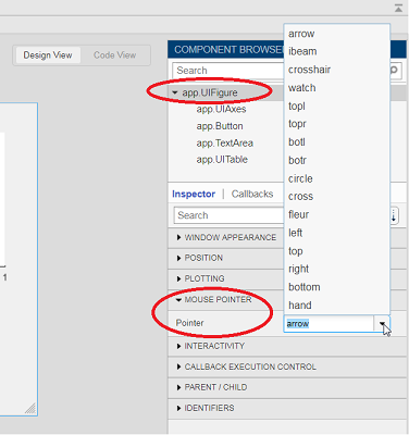
Starting in r2020a , you can change the mouse pointer symbol in apps and uifigures.
The Pointer property of a figure defines the cursor’s default pointer symbol within the figure. You can also create your own pointer symbols (see part 3, below).
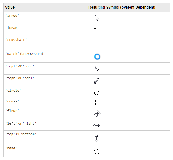
Part 1. How to define a default pointer symbol for a uifigure or app
For figures or uifigures, set the pointer property when you define the figure or change the pointer property using the figure handle.
% Set pointer when creating the figure
uifig = uifigure('Pointer', 'crosshair');
% Change pointer after creating the figure
uifig.Pointer = 'crosshair';
For apps made in AppDesigner, you can either set the pointer from the Design View or you can set the pointer property of the app’s UIFigure from the startup function using the second syntax shown above.
Part 2. How to change the pointer symbol dynamically
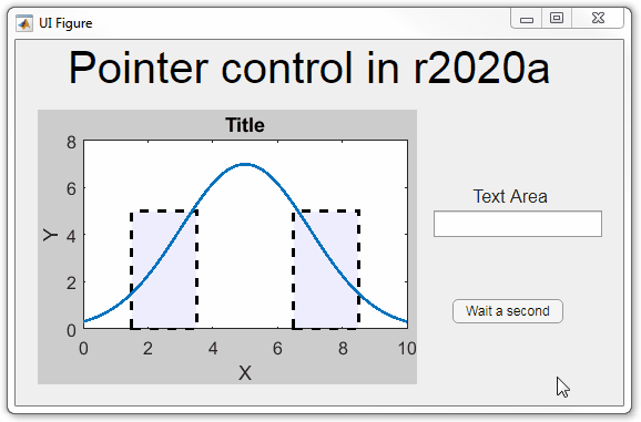
The pointer can be changed by setting specific conditions that trigger a change in the pointer symbol.
For example, the pointer can be temporarily changed to a busy-symbol when a button is pressed. This ButtonPushed callback function changes the pointer for 1 second.
function WaitasecondButtonPushed(app, event)
   % Change pointer for 1 second.
   set(app.UIFigure, 'Pointer','watch')
   pause(1)
   % Change back to default.
   set(app.UIFigure, 'Pointer','arrow')
   app.WaitasecondButton.Value = false;
end
The pointer can be changed every time it enters or leaves a uiaxes or any plotted object within the uiaxes. This is controlled by a set of pointer management functions that can be set in the app’s startup function.
iptSetPointerBehavior(obj,pointerBehavior) allows you to define what happens when the pointer enters, leaves, or moves within an object. Currently, only axes and axes objects seem to be supported for UIFigures.
iptPointerManager(hFigure,'enable') enables the figure’s pointer manager and updates it to recognize the newly added pointer behaviors.
The snippet below can be placed in the app’s startup function to change the pointer to crosshairs when the pointer enters the outerposition of a uiaxes and then change it back to the default arrow when it leaves the uiaxes.
% Define pointer behavior when pointer enter axes
pm.enterFcn = @(~,~) set(app.UIFigure, 'Pointer', 'crosshair');
pm.exitFcn  = @(~,~) set(app.UIFigure, 'Pointer', 'arrow');
pm.traverseFcn = [];
iptSetPointerBehavior(app.UIAxes, pm)
% Enable pointer manager for app
iptPointerManager(app.UIFigure,'enable');
Any function can be triggered when entering/exiting an axes object which makes the pointer management tools quite powerful. This snippet below defines a custom function cursorPositionFeedback() that responds to the pointer entering/exiting a patch object plotted within the uiaxes. When the pointer enters the patch, the patch color is changed to red, the pointer is changed to double arrows, and text appears in the app’s text area. When the pointer exits, the patch color changes back to blue, the pointer changes back to crosshairs, and the text area is cleared.
% Plot patch on uiaxes
hold(app.UIAxes, 'on')
region1 = patch(app.UIAxes,[1.5 3.5 3.5 1.5],[0 0 5 5],'b','FaceAlpha',0.07,...
    'LineWidth',2,'LineStyle','--','tag','region1');
% Define pointer behavior for patch
pm.enterFcn = @(~,~) cursorPositionFeedback(app, region1, 'in');
pm.exitFcn  = @(~,~) cursorPositionFeedback(app, region1, 'out');
pm.traverseFcn = [];
iptSetPointerBehavior(region1, pm)
% Enable pointer manager for app
iptPointerManager(app.UIFigure,'enable');
function cursorPositionFeedback(app, hobj, inout)
% When inout is 'in', change hobj facecolor to red and update textbox.
% When inout is 'out' change hobj facecolor to blue, and clear textbox.
% Check tag property of hobj to identify the object.
switch lower(inout)
    case 'in'
        facecolor = 'r';
        txt = 'Inside region 1';
        pointer = 'fleur';
    case 'out'
        facecolor = 'b';
        txt = '';
        pointer = 'crosshair';
end
hobj.FaceColor = facecolor;
app.TextArea.Value = txt;
set(app.UIFigure, 'Pointer', pointer)
end
The app showing the demo below is attached.
Part 3. Create your own custom pointer symbol
- Set the figure’s pointer property to ‘custom’.
- Set the figure’s PointerShapeCData property to the custom pointer matrix. A custom pointer is defined by a 16x16 or 32x32 matrix where NaN values are transparent, 1=black, and 2=white.
- Set the figure’s PointerShapeHotSpot to [m,n] where m and n are the coordinates that define the tip or "hotspot" of the matrix.
This demo uses the attached mat file to create a black hand pointer symbol.
iconData = load('blackHandPointer.mat');
uifig = uifigure();
uifig.Pointer = 'custom';
uifig.PointerShapeCData = iconData.blackHandIcon;
uifig.PointerShapeHotSpot = iconData.hotspot;
Also see Jiro's pointereditor() function on the file exchange which allows you to draw your own pointer.
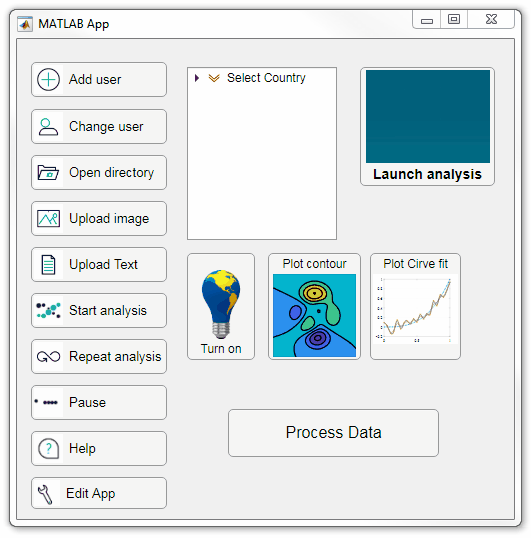
Starting in r2020a, AppDesigner buttons and TreeNodes can display animated GIFs, SVG, and truecolor image arrays.
Every component in the App above is either a Button or a TreeNode!
Prior to r2020a the icon property of buttons and TreeNodes in AppDesigner supported JPEG, PNG, or GIF image files specified by a character vector or string array but did not support animation.
Here's how to display an animated GIF, SVG, or truecolor image in an App button or TreeNode starting in r2020a. And for the record, "GIF" is pronounced with a hard-g .
Display an animated GIF
Select the button or TreeNode from within AppDesigner > Design View and navigate to Component Browser > Inspector > Button dropdown list of properties (shown below). Select an animated GIF file and set the text and icon alignment properties.
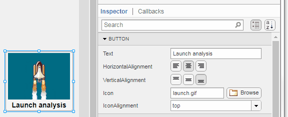
To set the icon property programmatically,
app.Button.Icon = 'launch.gif'; % or "launch.gif"
The filename can be an image file on the Matlab path (see addpath ) or a full path to an image file.
Display SVG
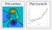
Use “scalable vector graphics” files for high-resolution images that are scaled to different sizes while preserving their shape and retaining their clarity. A quick and easy way to remember which plotting function is assigned to each button in an app is to assign an image of the plot to the button.
After creating the figure, expand the axes by setting the position or outerposition property to [0 0 1 1] in normalized units and save the figure using File > Save as and select svg format. Save the image to the folder containing your app. Then follow the same procedure as animated GIFs.
Display truecolor image
A truecolor image comes in the form of an [m x n x 3] array where each m x n pixel color is specified by an RGB triplet (read more) . This feature allows you to dynamically create a digital image or to upload an image from a mat file rather than an image file.
In this example, a progress bar is created within the uibutton callback function and it’s updated within a loop. For a complete demo of this feature see this comment .
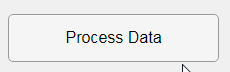
% Button pushed function: ProcessDataButton
function ProcessDataButtonPushed(app, event)
    % Change button name to "Processing"
    app.ProcessDataButton.Text = 'Processing...';
    % Put text on top of icon
    app.ProcessDataButton.IconAlignment = 'bottom';
    % Create waitbar with same color as button
    wbar = permute(repmat(app.ProcessDataButton.BackgroundColor,15,1,200),[1,3,2]);
    % Black frame around waitbar
    wbar([1,end],:,:) = 0;
    wbar(:,[1,end],:) = 0;
    % Load the empty waitbar to the button
    app.ProcessDataButton.Icon = wbar;
    % Loop through something and update waitbar
    n = 10;
    for i = 1:n
        % Update image data (royalblue)
        % if mod(i,10)==0 % update every 10 cycles; improves efficiency
         currentProg = min(round((size(wbar,2)-2)*(i/n)),size(wbar,2)-2);
         RGB = app.ProcessDataButton.Icon;
         RGB(2:end-1, 2:currentProg+1, 1) = 0.25391; % (royalblue)
         RGB(2:end-1, 2:currentProg+1, 2) = 0.41016;
         RGB(2:end-1, 2:currentProg+1, 3) = 0.87891;
           app.ProcessDataButton.Icon = RGB;
          % Pause to slow down animation
          pause(.3)
          % end
      end
      % remove waitbar
      app.ProcessDataButton.Icon = '';
      % Change button name
      app.ProcessDataButton.Text = 'Process Data';
  end
The for-loop above was improved on Feb-11-2022.
Credit for the black & teal GIF icons: lordicon.com