Add background colour for certain values in a plot
이전 댓글 표시
Hi all,
I have a 30,000 x 12 x 4 timetable (called SR) with tree stem diameter values measured every 20 minutes.
Within the data, I identified periods of contracted stems lasting longer than 2 days (>144 consecutive values), let's call them "drought" for simplicity. These values (-2 for "drought", NaN otherwise) are saved as a separate timetable variable called Drought. When plotting the stem diameter data in a simple line plot, I would like to add a pink background to mark all periods of "drought".
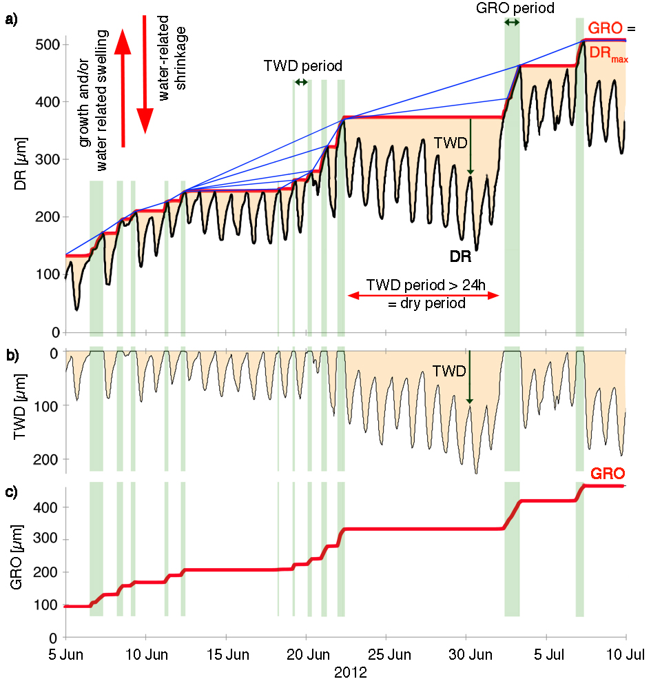
In the example below (source: natkon.ch), periods of growth were marked with green background. I want to do the same, but for dry periods (i.e. value -2 in the variable Drought) in pink. On top of the pink background I'll be plotting the stem radii (black line in the example below).
I've read about the rectangle and patch functions, but, being a beginner Matlab user, I'm not sure how to specify the coordinates. Due to the amount of data, I'll be plotting it in a loop. Do I need to use a loop similar to the one I used to identify the "drought" periods, or is there an easier way?
% Drought - a 30,000 x 12 x 4 matrix of data, where -1 means stem contraction
for k = 1:size(Drought,3)
for j = 1:size(Drought,2)
for i = 2:size(Drought,1)
if Drought(i,j,k) == -1 && isequal(Drought(i-1,j,k),-1)==0 % beginning of stem contraction
DroughtStart = i;
elseif isequal(Drought(i,j,k),-1)==0 && Drought(i-1,j,k) == -1 % end of stem contraction
if i-DroughtStart > 144 % did it last more than two days in a row?
Drought(DroughtStart:i-1,j,k) = -2; % if so, change values within this period to -2
end
end
end
end
end
EDIT: More details about the data as requested:
The dimensions of the timetable (30,000 x 12 x 4) correspond to time (30,000 time steps), treatments (12) and sites (4). At each site, only some treatments are present; the remaining columns contain NaNs.
Attached is a one-month extract from the stem radii and "drought" data.
댓글 수: 3
darova
2019년 10월 15일
Please attach the data.
It also would be great if you could attach a picture of results you expect
Shubham Gupta
2019년 10월 15일
"When plotting the stem diameter data"
The plot you want to create, is it 2D or 3D? May I know what will be your XData, YData & ZData for the plot?
Corymbiamaculata
2019년 10월 15일
채택된 답변
darova
2019년 10월 16일
I couldn't open your data (maybe my MATLAB is older). I created some data and here is an example
clc,clear
x = linspace(0,20,200);
y = x + sin(x) + sin(2*x);
yy = [min(y) max(y) max(y) min(y)]; % Y limits of patch
y1 = y*0;
k = 1;
b = true; % start/end indicator of slope
plot(x,y)
hold on
for i = 1:length(x)
if y(i) > y(k)
y1(i) = y(i); % increasing slope
k = i;
if b % start of slope
b = false;
k1 = i;
end
else
y1(i) = y(k); % decreeasing slope
if ~b % end of slope
xx = [x(k) x(k) x(k1) x(k1)]; % x limits of patch
patch(xx,yy,'b',...
'FaceAlpha',0.5,...
'EdgeColor','none');
b = true;
end
end
end
plot(x,y1,'r')
hold off
추가 답변 (0개)
카테고리
도움말 센터 및 File Exchange에서 Surface and Mesh Plots에 대해 자세히 알아보기
Community Treasure Hunt
Find the treasures in MATLAB Central and discover how the community can help you!
Start Hunting!
Translated by ![]()