Visualize Correlation Between Temperature and Humidity
This example show how to read multiple variables from an existing ThingSpeak™ channel and generate a scatter plot to examine the correlation in temperature and pressure. In the example, you modify one of the code templates provided by the MATLAB Analysis and MATLAB Visualizations app.
ThingSpeak channel 12397 contains weather data from a weather station on top of a parking garage on the MathWorks® campus in Natick, MA. Field 4 contains the temperature measurement, field 3 contains the humidity measurement.
Create a MATLAB Visualization from Template Code
To create a scatter plot visualization of data from a ThingSpeak channel, you can write a MATLAB® script using a code template provided in the MATLAB Visualizations app.
Go to the Apps tab and select MATLAB Visualizations. Click New, select Visualize correlation between temperature and humidity, and click Create.

Visualize Your Data
ThingSpeak populates the MATLAB Code field with the code to generate the temperature histogram.
1) Set the variables for communicating with ThingSpeak. In this example, the read API key is unnecessary because the weather station channel is public. If you are reading from your own channel, you can modify these values.
readChannelID = 12397;
TemperatureFieldID = 4;
HumidityFieldID = 3;
readAPIKey = '';
2) Use thingSpeakRead to retrieve 300 points from the temperature and humidity fields.
data = thingSpeakRead(readChannelID,'Fields',[TemperatureFieldID HumidityFieldID], ...
      'NumPoints',300, 'ReadKey',readAPIKey);
3) Extract the temperature and wind speed data.
temperatureData = data(:, 1);
humidityData = data(:, 2);
4) Use scatter (MATLAB) to generate the plot. Set the x-axis and y-axis labels using xlabel (MATLAB) and ylabel (MATLAB).
scatter(temperatureData,humidityData);
xlabel('Temperature');
ylabel('Humidity');
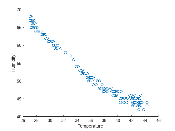
5) You can edit the template code to fit your application. For example, you can edit the number of points to read and the plot titles in the code. Click Save and Run to generate the output. Since the scatter plot is generated from live data, your plot looks similar but not identical to this plot.
Add Visualization to Your Channel View
Optionally, you can add saved visualizations to your channel. In Display Settings, click Add/Edit this Visualization to a Channel to expand the channels list.

Click the check box that corresponds to the channel you want to add the visualization to. To add private visualizations, check Private View. To share the URL and add the visualization to the Public View, select Create a public URL. To update your selections, click Save Display Settings.

Determine Linear Fit
The polyfit (MATLAB) function can provide a fit to linear data when the degree of fit is set to a value of 1. The following code is not included in the template. To plot multiple distributions, add this code to the template.
1) Use polyfit (MATLAB) to perform a fit to the data. Specify 1 as the last argument for a linear fit.
fitData = polyfit(temperatureData,humidityData,1);
display(fitData(1),'Slope');
Slope = -5.5865e-15
display(fitData(2),'Intercept');Intercept = 95.0000
2) Because temperature and humidity have no definite relation, the linear fit is not necessarily a good fit. You can check the fit quality with a correlation coefficient. Calculate and display the correlation coefficient.
r = corrcoef(temperatureData,humidityData);
display(r(2),'Correlation Coefficient');
NaN
3) Press Save and Run to generate the dual plot. The scatter plot has a negative slope, and thus a negative correlation coefficient: humidity decreases with increasing temperature for this measurement. An r value of 1 or -1 indicates a perfect fit. The r value for this data confirms the fit is relatively poor.
See Also
Functions
scatter(MATLAB) |polyfit(MATLAB) |corrcoef(MATLAB) |thingSpeakRead|xlabel(MATLAB) |ylabel(MATLAB)