uistyle
Create style for UI component
Description
s = uistyle creates an empty style for a table, tree, list box, or
drop-down UI component and returns the Style object. Use
Style objects to create visual styles for cells in tables, nodes in
trees, and items in list boxes and drop-down components. Use this syntax to create a style
that you want to add properties to later.
s = uistyle( specifies
Name,Value)Style property values by using one or more name-value arguments. For
example, uistyle("BackgroundColor","g") creates a style with a background
color of green.
Examples
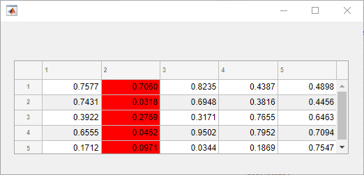
Change the background color of the cells in a table column by creating a style and applying it to the table.
Create a figure with a table UI component in it and populate the table with numeric data.
fig = uifigure;
fig.Position = [500 500 520 220];
uit = uitable(fig);
uit.Data = rand(5);
uit.Position = [20 30 480 135];
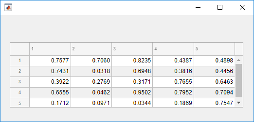
Then, create a style with a specific background color and add the style to the
second column of the table using the addStyle function.
s = uistyle("BackgroundColor","red");
addStyle(uit,s,"column",2)
Create some sample table data that lists paths to files and their load status.
DataFiles = ["C:/Documents/MyProject/MyData/file1.mat"; ...
    "C:/Documents/MyProject/MyData/file2.mat"; ...
    "C:/Documents/MyProject/MyData/file3.mat"];
LoadStatus = ["Success";"Success";"Failure"];
T = table(DataFiles,LoadStatus);
Display the table data in a table UI component in a UI figure.
fig = uifigure("Position",[500 500 400 350]);
t = uitable(fig,"Data",T,"ColumnWidth",{'2x','1x'});
Create three styles: one that specifies that long text is clipped on the left, one with an icon to indicate success, and one with an icon to indicate an error. The two icon styles additionally specify that the icon is aligned at the far right margin of the table cell.
sClip = uistyle("HorizontalClipping","left");
sPass = uistyle("Icon","success","IconAlignment","rightmargin");
sFail = uistyle("Icon","error","IconAlignment","rightmargin");
Apply the three styles to different parts of the table UI component. Apply the first style to the first column so that the sample file names are visible, and apply the second and third styles to cells in the second column to provide a visual indication of the file load status.
addStyle(t,sClip,"column",1)
addStyle(t,sPass,"cell",[1 2;2 2])
addStyle(t,sFail,"cell",[3 2])
![]()
Create some sample table data with pages in the MATLAB® documentation. For each page, specify a link to the page and some runnable MATLAB code using HTML markup.
Page = ["<a href='https://www.mathworks.com/help/matlab/gui-development.html'>App Building</a>"; ...
    "<a href='https://www.mathworks.com/help/matlab/graphics.html'>Graphics</a>"; ...
    "<a href='https://www.mathworks.com/help/matlab/mathematics.html'>Mathematics</a>"];
Example = ["<a href='matlab:uibutton'>Run Code</a>";
    "<a href='matlab:plot(1:10)'>Run Code</a>";
    "<a href='matlab:disp(pi)'>Run Code</a>"];
T = table(Page,Example);
Display the table data in a table UI component in a UI figure.
fig = uifigure("Position",[500 500 350 350]);
tbl = uitable(fig,"Data",T);
Create a style that specifies that text is interpreted as HTML markup. Apply this style to the entire UI table.
s = uistyle("Interpreter","html");
addStyle(tbl,s);
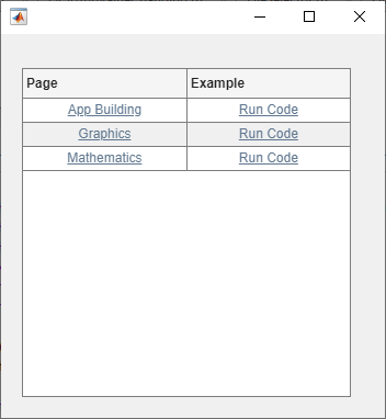
Click the links in the Page column to open the documentation in a
web browser. Click the links in the Examples column to run the
example code in MATLAB.
For more information about creating links that execute commands, see Create Hyperlinks that Run Functions.
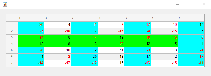
Create multiple styles and add them to different parts of a table UI component.
Create a figure with a table UI component in it and display numeric data in the table. Find the row and column subscripts for elements in the table with a value less than zero so you can style these cells later.
fig = uifigure;
fig.Position = [500 500 720 230];

uit = uitable(fig);
uit.Data = randi([-20,20],7);
uit.Position = [20 30 680 185];

[row,col] = find(uit.Data < 0);
Create two background color styles and one style that specifies font color and weight. Add a cyan background color to columns 1, 3, and 5. Emphasize the cells with negative values by making their font red and bold. Then, style rows 3 and 4 with a green background color. Finally, reuse the cyan background color style and add it to column 7. For cells where multiple styles of the same type are added, the style that is added last is the one that displays in the cell. For example, rows 3 and 4 of the last column have a cyan background, which corresponds to the last style added to those cells.
s1 = uistyle;
s1.BackgroundColor = "cyan";
addStyle(uit,s1,"column",[1 3 5])

s2 = uistyle;
s2.FontColor = "red";
s2.FontWeight = "bold";
addStyle(uit,s2,"cell",[row,col])

s3 = uistyle;
s3.BackgroundColor = "green";
addStyle(uit,s3,"row",[3 4])

addStyle(uit,s1,"column",7)
Create a tree UI component in a UI figure. Add tree nodes that display equations of two types of polar plots. Use LaTeX markup to specify the tree node text. Then, expand all nodes in the tree.
fig = uifigure("Position",[500 500 300 350]);
tr = uitree(fig,"Position",[10 10 200 250]);
n1 = uitreenode(tr,Text="Circles");
n2 = uitreenode(tr,Text="Rose Curves");
n11 = uitreenode(n1,Text="$$r=a\cos(\theta)$$");
n12 = uitreenode(n1,Text="$$r=a\sin(\theta)$$");
n21 = uitreenode(n2,Text="$$r=a\cos(n\theta)$$");
n22 = uitreenode(n2,Text="$$r=a\sin(n\theta)$$");

expand(tr)
Create a style that specifies that text is interpreted as LaTeX markup. Apply this style to all nodes in the tree that are children of a top-level node.
s = uistyle("Interpreter","latex");
addStyle(tr,s,"level",2);

Style nodes in a tree that showcases a file structure to visually distinguish different file types.
Create a tree UI component. Each top-level node represents a folder. Each child node represents a file in that folder. Expand the tree to see all the nodes.
fig = uifigure("Position",[300 300 350 400]);
t = uitree(fig);

% Parent nodes
n1 = uitreenode(t,"Text","App 1");
n2 = uitreenode(t,"Text","App 2");
n3 = uitreenode(t,"Text","Images");

% Child nodes
n11 = uitreenode(n1,"Text","myapp1.m");
n21 = uitreenode(n2,"Text","myapp2.m");
n22 = uitreenode(n2,"Text","app2callback.m");
n31 = uitreenode(n3,"Text","peppers.png");

expand(t)

Create three styles: one with a bold font weight, one with an italic font angle, and one with an icon.
dirStyle = uistyle("FontWeight","bold");
mStyle = uistyle("FontAngle","italic");
imgStyle = uistyle("Icon","peppers.png");
Apply the bold style to the top-level nodes to distinguish the nodes that
represent folders. Apply the italic style to the children of the App
1 and App 2 nodes to distinguish the nodes that
represent MATLAB program files. Finally, apply the icon style to the node that
represents an image file to show a preview of the image.
addStyle(t,dirStyle,"level",1)
addStyle(t,mStyle,"node",[n1.Children;n2.Children])
addStyle(t,imgStyle,"node",n31)

Since R2023a
Create a list box with three items that represent different images.
fig = uifigure;
lb = uilistbox(fig,"Items",["Peppers","Nebula","Street"]);
Create three styles with icons that correspond to the list box items.
s1 = uistyle("Icon","peppers.png");
s2 = uistyle("Icon","ngc6543a.jpg");
s3 = uistyle("Icon","street1.jpg");
Add the styles to the list box items to display the icons.
addStyle(lb,s1,"item",1);
addStyle(lb,s2,"item",2);
addStyle(lb,s3,"item",3);
![]()
Since R2023a
Create a drop-down UI component with three items.
fig = uifigure;
dd = uidropdown(fig,"Items",["Good","Fair","Poor"]);
Create three background color styles.
s1 = uistyle("BackgroundColor","#77AC30");
s2 = uistyle("BackgroundColor","#EDB120");
s3 = uistyle("BackgroundColor","#F77A8F");
Add the styles to the drop-down component items to change their background colors.
addStyle(dd,s1,"item",1);
addStyle(dd,s2,"item",2);
addStyle(dd,s3,"item",3);
The item background colors update, and the appearance of the component reflects the style of the selected item. The style does not change the color that displays when a user points to an item.

Name-Value Arguments
Specify optional pairs of arguments as
Name1=Value1,...,NameN=ValueN, where Name is
the argument name and Value is the corresponding value.
Name-value arguments must appear after other arguments, but the order of the
pairs does not matter.
Example: s = uistyle(BackgroundColor="blue")
Before R2021a, use commas to separate each name and value, and enclose
Name in quotes.
Example: s = uistyle("BackgroundColor","blue")
Background color, specified as an RGB triplet, a hexadecimal color code, or one of the color options listed in the table.
RGB triplets and hexadecimal color codes are useful for specifying custom colors.
An RGB triplet is a three-element row vector whose elements specify the intensities of the red, green, and blue components of the color. The intensities must be in the range
[0,1]; for example,[0.4 0.6 0.7].A hexadecimal color code is a character vector or a string scalar that starts with a hash symbol (
#) followed by three or six hexadecimal digits, which can range from0toF. The values are not case sensitive. Thus, the color codes"#FF8800","#ff8800","#F80", and"#f80"are equivalent.
Alternatively, you can specify some common colors by name. This table lists the named color options, the equivalent RGB triplets, and hexadecimal color codes.
| Color Name | Short Name | RGB Triplet | Hexadecimal Color Code | Appearance |
|---|---|---|---|---|
"red" | "r" | [1 0 0] | "#FF0000" |
|
"green" | "g" | [0 1 0] | "#00FF00" |
|
"blue" | "b" | [0 0 1] | "#0000FF" |
|
"cyan"
| "c" | [0 1 1] | "#00FFFF" |
|
"magenta" | "m" | [1 0 1] | "#FF00FF" |
|
"yellow" | "y" | [1 1 0] | "#FFFF00" |
|
"black" | "k" | [0 0 0] | "#000000" |
|
"white" | "w" | [1 1 1] | "#FFFFFF" |
|
This table lists the default color palettes for plots in the light and dark themes.
| Palette | Palette Colors |
|---|---|
Before R2025a: Most plots use these colors by default. |
|
|
|
You can get the RGB triplets and hexadecimal color codes for these palettes using the orderedcolors and rgb2hex functions. For example, get the RGB triplets for the "gem" palette and convert them to hexadecimal color codes.
RGB = orderedcolors("gem");
H = rgb2hex(RGB);
Before R2023b: Get the RGB triplets using RGB =
get(groot,"FactoryAxesColorOrder").
Before R2024a: Get the hexadecimal color codes using H =
compose("#%02X%02X%02X",round(RGB*255)).
Font color, specified as an RGB triplet, a hexadecimal color code, or one of the options listed in the table.
RGB triplets and hexadecimal color codes are useful for specifying custom colors.
An RGB triplet is a three-element row vector whose elements specify the intensities of the red, green, and blue components of the color. The intensities must be in the range
[0,1]; for example,[0.4 0.6 0.7].A hexadecimal color code is a character vector or a string scalar that starts with a hash symbol (
#) followed by three or six hexadecimal digits, which can range from0toF. The values are not case sensitive. Thus, the color codes"#FF8800","#ff8800","#F80", and"#f80"are equivalent.
Alternatively, you can specify some common colors by name. This table lists the named color options, the equivalent RGB triplets, and hexadecimal color codes.
| Color Name | Short Name | RGB Triplet | Hexadecimal Color Code | Appearance |
|---|---|---|---|---|
"red" | "r" | [1 0 0] | "#FF0000" |
|
"green" | "g" | [0 1 0] | "#00FF00" |
|
"blue" | "b" | [0 0 1] | "#0000FF" |
|
"cyan"
| "c" | [0 1 1] | "#00FFFF" |
|
"magenta" | "m" | [1 0 1] | "#FF00FF" |
|
"yellow" | "y" | [1 1 0] | "#FFFF00" |
|
"black" | "k" | [0 0 0] | "#000000" |
|
"white" | "w" | [1 1 1] | "#FFFFFF" |
|
This table lists the default color palettes for plots in the light and dark themes.
| Palette | Palette Colors |
|---|---|
Before R2025a: Most plots use these colors by default. |
|
|
|
You can get the RGB triplets and hexadecimal color codes for these palettes using the orderedcolors and rgb2hex functions. For example, get the RGB triplets for the "gem" palette and convert them to hexadecimal color codes.
RGB = orderedcolors("gem");
H = rgb2hex(RGB);
Before R2023b: Get the RGB triplets using RGB =
get(groot,"FactoryAxesColorOrder").
Before R2024a: Get the hexadecimal color codes using H =
compose("#%02X%02X%02X",round(RGB*255)).
Font weight, specified as one of these values:
'normal'— Default weight as defined by the particular font'bold'— Thicker character outlines than'normal'
Not all fonts have a bold font weight. For fonts that do not, specifying
'bold' results in the normal font weight.
Font angle, specified as 'normal' or
'italic'. Not all fonts have an italic font angle. For fonts that
do not, specifying 'italic' results in the normal font
angle.
Font name, specified as a system-supported font name. The default font depends on the specific operating system and locale.
If the specified font is not available, then MATLAB uses the best match among the fonts available on the system where the app is running.
Horizontal alignment of table cell text, specified as one of the values in the table.
| Value | Example |
|---|---|
'left' |
|
'right' |
|
'center' |
|
If you add a Style object that specifies horizontal alignment
to a table UI component, it takes precedence over the justifications associated with
cell format values that you specify for the ColumnFormat property
on the Table object. The ColumnFormat property
still converts values as it normally would.
Note
If you add a Style object that specifies horizontal alignment
to a tree UI component, the HorizontalAlignment value has no
effect on the component appearance.
Side on which long text is clipped, specified as one of the values in the table.
| Value | Example |
|---|---|
'left' |
|
'right' |
|
Note
If you add a Style object that specifies horizontal clipping
to a subset of nodes of a tree or a subset of items of a list box or drop-down UI
component, the HorizontalClipping value has no effect on the
component appearance. You can still add the style to the entire tree, list box, or
drop-down UI component.
Icon, specified as a predefined icon or a custom icon.
Predefined Icon
This table lists the values to specify the predefined icons.
| Value | Icon |
|---|---|
'question' |
|
'info' |
|
'success' |
|
'warning' |
|
'error' |
|
'none' | No icon displays. |
Custom Icon
Specify a custom icon as one of these values:
A character vector or string scalar that specifies the file name of an SVG, JPEG, GIF, or PNG image that is on the MATLAB path. Alternatively, you can specify a full path to the image file.
An
m-by-n-by-3 truecolor image array or anm-by-ngrayscale image array. See Working with Image Types in MATLAB for more information.
Alignment of table cell icon, specified as one of the values in the table. The
examples in the table show the result of specifying each
IconAlignment value for a table UI component with a
HorizontalAlignment style of
'center'.
| Value | Description | Example |
|---|---|---|
'left' | The icon is displayed directly to the left of the text. |
|
'right' | The icon is displayed directly to the right of the text. |
|
'center' | The icon is displayed in the center of the cell, behind the text. |
|
'leftmargin' | The icon is displayed on the far left of the cell, regardless of the text position. This value is equivalent to
|
|
'rightmargin' | The icon is displayed on the far right of the cell, regardless of the text position. This value is equivalent to
|
|
Note
If you add a Style object that specifies icon alignment to a
tree UI component, the IconAlignment value has no effect on the
tree appearance.
Text interpreter, specified as:
'none'— Display literal characters.'tex'— Interpret text using a subset of TeX markup.'latex'— Interpret text using a subset of LaTeX markup.'html'— Interpret text using a subset of HTML markup.
TeX Markup
Use TeX markup to add superscripts and subscripts and to include special characters in the text.
Modifiers remain in effect until the end of the text.
Superscripts and subscripts are an exception because they modify only the next character or the
characters within the curly braces. When you set the interpreter to "tex",
the supported modifiers are as follows.
| Modifier | Description | Example |
|---|---|---|
^{ } | Superscript | "text^{superscript}" |
_{ } | Subscript | "text_{subscript}" |
\bf | Bold font | "\bf text" |
\it | Italic font | "\it text" |
\sl | Oblique font (usually the same as italic font) | "\sl text" |
\rm | Normal font | "\rm text" |
\fontname{ | Font name — Replace
| "\fontname{Courier} text" |
\fontsize{ | Font size —Replace
| "\fontsize{15} text" |
\color{ | Font color — Replace
red, green,
yellow, magenta,
blue, black,
white, gray,
darkGreen, orange, or
lightBlue. | "\color{magenta} text" |
\color[rgb]{specifier} | Custom font color — Replace
| "\color[rgb]{0,0.5,0.5} text" |
This table lists the supported special character sequences for
the "tex" interpreter. Some of the symbols look slightly different than they
do in MATLAB.
| Character Sequence | Symbol | Character Sequence | Symbol | Character Sequence | Symbol |
|---|---|---|---|---|---|
| α |
| υ |
| ~ |
| ∠ |
| ϕ |
| ≤ |
|
|
| χ |
| ∞ |
| β |
| ψ |
| ♣ |
| γ |
| ω |
| ♦ |
| δ |
| Γ |
| ♥ |
| ϵ |
| Δ |
| ♠ |
| ζ |
| Θ |
| ↔ |
| η |
| Λ |
| ← |
| θ |
| Ξ |
| ⇐ |
| ϑ |
| Π |
| ↑ |
| ι |
| Σ |
| → |
| κ |
| ϒ |
| ⇒ |
| λ |
| Φ |
| ↓ |
| µ |
| Ψ |
| º |
| ν |
| Ω |
| ± |
| ξ |
| ∀ |
| ≥ |
| π |
| ∃ |
| ∝ |
| ρ |
| ∍ |
| ∂ |
| σ |
| ≅ |
| • |
| ς |
| ≈ |
| ÷ |
| τ |
| ℜ |
| ≠ |
| ≡ |
| ⊕ |
| ℵ |
| ℑ |
| ∪ |
| ℘ |
| ⊗ |
| ⊆ |
| ∅ |
| ∩ |
| ∈ |
| ⊇ |
| ⊃ |
| ⌈ |
| ⊂ |
| ∫ |
| · |
| ο |
| ⌋ |
| ¬ |
| ∇ |
| ⌊ |
| x |
| ... |
| ⊥ |
| √ |
| ´ |
| ∧ |
| ϖ |
| ∅ |
| ⌉ |
| 〉 |
| | |
| ∨ |
| 〈 |
| © |
LaTeX Markup
To use LaTeX markup, set the interpreter to 'latex'. Use
LaTeX markup to format and display mathematical expressions, equations, and special
characters. Use dollar symbols around the marked up text. For example, use
'$\int_1^{20} x^2 dx$' for inline mode or
'$$\int_1^{20} x^2 dx$$' for display mode.
The displayed text uses the default LaTeX font style. The
FontName, FontWeight, and
FontAngle label properties do not have an effect. To change
the font style, use LaTeX markup.
MATLAB supports most standard LaTeX math mode commands. For more information, see Supported LaTeX Commands.
HTML Markup
To use HTML markup, set the interpreter to 'html'. Setting
font styles via HTML overrides any equivalent Style font
properties. For example, the following code results in red text.
fig = uifigure;
s1 = uistyle("Interpreter","html");
s2 = uistyle("FontColor","blue");

t = uitable(fig);
t.Data = ["<p style='color: red;'>Cell 1</p>"; "<p style='color: red;'>Cell 2</p>"];
addStyle(t,s1)
addStyle(t,s2)
The interpreter supports a subset of HTML markup. As a general guideline, the interpreter supports text-related tags and styles. Unsupported tags and styles are ignored.
This table lists the supported elements and element attributes.
| HTML Element | Attributes | Description |
|---|---|---|
a | style, target, href, title | Hyperlink |
abbr | style, title | Abbreviation or acronym |
address | style | Contact information |
article | style | Self-contained, independent content |
aside | style | Content indirectly related to the main content |
b | style | Bold text |
bdi | style, dir | Content formatted in a different direction from surrounding text |
bdo | style, dir | Content formatted in a different direction from surrounding text |
big | style | Text one font size level larger than surrounding text (obsolete in HTML5) |
blockquote | style, cite | Extended quotation |
br | n/a | Line break |
caption | style | Caption or title of a table |
center | style | Content centered horizontally |
cite | style | Title of a creative work |
code | style | Fragment of code |
col | style, align, valign, span, width | Column within a table |
colgroup | style, align, valign, span, width | Group of columns within a table |
dd | style | Term or value in a description list |
del | style, datetime | Text that was deleted from a document |
details | style, open | Interactive widget with text visible only when toggled to 'open' state |
dl | style | Description list |
dt | style | Term or value in a description list |
em | style | Emphasized text (typically displayed in italic) |
font | style, color, size, face | Text with specified font properties (obsolete in HTML5) |
footer | style | Footer |
h1. h2, h3, h4, h5, h6 | style | Section heading — <h1> is the highest level of heading and <h6> is the lowest |
header | style | Introductory content |
hr | style | Thematic break |
i | style | Text offset from the surrounding content — by default rendered as italic |
ins | style, datetime | Text inserted into a document |
li | style | Item in a list |
mark | style | Marked or highlighted text |
ol | style | Ordered list |
p | style | Paragraph |
pre | style | Preformatted text |
s | style | Text with a strikethrough |
strike | style | Text with a strikethrough (obsolete in HTML5) |
section | style | Standalone section |
small | style | Text one font size level smaller than surrounding text (obsolete in HTML5) |
sub | style | Subscript |
sup | style | Superscript |
strong | style | Text with strong importance |
table | style, width, border, align, valign | Table |
tbody | style, align, valign | Table body |
td | style, width, rowspan, colspan, align, valign | Table data cell |
tfoot | style, align, valign | Set of table rows that summarize the table columns |
th | style, width, rowspan, colspan, align, valign | Table data cell specified as a header of a group of cells |
thead | style, align, valign | Set of table rows that specify the column heads |
tr | style, rowspan, align, valign | Row of table cells |
tt | style | Monospace text (obsolete in HTML5) |
u | style | Text with an unarticulated annotation — by default rendered as an underline |
ul | style | Unordered list |
For more information about these elements, see https://developer.mozilla.org/en-US/docs/Web/HTML/Element.
To use HTML markup to create a hyperlink that runs MATLAB code, see Create Hyperlinks that Run Functions.
You can use HTML style attributes to format HTML content. A style attribute is a string of CSS attributes and their values.
These CSS attributes are supported:
background-colorborder-bottomborder-bottom-colorborder-bottom-left-radiusborder-bottom-right-radiusborder-bottom-styleborder-bottom-widthborder-leftborder-left-colorborder-left-styleborder-left-widthborder-radiusborder-rightborder-right-colorborder-right-styleborder-right-widthborder-spacingborder-styleborder-topborder-top-colorborder-top-left-radiusborder-top-right-radiusborder-top-styleborder-top-widthborder-widthcolordirectionfont-familyfont-sizefont-stylefont-weightheighthiddenline-heightmarginmargin-bottommargin-leftmargin-rightmargin-topmax-heightmax-widthmin-heightmin-widthoverflowoverflow-wrapoverflow-xoverflow-ypaddingpadding-bottompadding-leftpadding-rightpadding-toptext-aligntext-anchortext-decorationtext-indenttext-overflowtext-shadowtext-transformtitletranslatewhite-spacewidth
For more information about these attributes, see https://developer.mozilla.org/en-US/docs/Web/CSS/Reference.
Algorithms
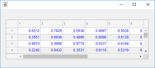
Style objects that you add to a UI
component take visual precedence over properties that you set on the component object, no
matter the order in which you created them. For example, in this code, the blue font color is
displayed in the table even though red foreground color was set on the
Table object
last.
uit = uitable(uifigure,'Data',rand(100,10));

s = uistyle;
s.FontColor = 'blue';
addStyle(uit,s);

uit.ForegroundColor = 'red';
Version History
Introduced in R2019bCreate styles to add to items of a list box or drop-down UI component. Use the
addStyle function to add a style to a ListBox or
DropDown object.
Use the uistyle function to create styles to add icons and format
text for table and tree UI components.
Specify the
Iconproperty of the style object to add icons to table cells and tree nodes.Specify the
IconAlignmentproperty of the style object to modify where the icon appears in relation to the text in table cells.Specify the
Interpreterproperty of the style object to format text or add links using HTML markup, or to add equations using TeX or LaTeX markup for table cells and tree nodes.Specify the
HorizontalClippingproperty of the style object to control whether long text is clipped on the left or the right in table cells and tree nodes.
Create styles to add to nodes and levels of a tree UI component. Use the
addStyle function to add a style to a Tree
object.
See Also
Functions
addStyle|removeStyle|uitable|uitree|uilistbox|uidropdown
Properties
- Style Properties |
Table|Tree|CheckBoxTree|DropDown|ListBox
MATLAB Command
You clicked a link that corresponds to this MATLAB command:
Run the command by entering it in the MATLAB Command Window. Web browsers do not support MATLAB commands.
웹사이트 선택
번역된 콘텐츠를 보고 지역별 이벤트와 혜택을 살펴보려면 웹사이트를 선택하십시오. 현재 계신 지역에 따라 다음 웹사이트를 권장합니다:
또한 다음 목록에서 웹사이트를 선택하실 수도 있습니다.
사이트 성능 최적화 방법
최고의 사이트 성능을 위해 중국 사이트(중국어 또는 영어)를 선택하십시오. 현재 계신 지역에서는 다른 국가의 MathWorks 사이트 방문이 최적화되지 않았습니다.
미주
- América Latina (Español)
- Canada (English)
- United States (English)
유럽
- Belgium (English)
- Denmark (English)
- Deutschland (Deutsch)
- España (Español)
- Finland (English)
- France (Français)
- Ireland (English)
- Italia (Italiano)
- Luxembourg (English)
- Netherlands (English)
- Norway (English)
- Österreich (Deutsch)
- Portugal (English)
- Sweden (English)
- Switzerland
- United Kingdom (English)


