Visualize Linear Fit to Scattered ThingSpeak Data
This example shows how to visualize the trend between ambient temperature and relative humidity using Curve Fitting Toolbox&trade.
Read Data from the Weather Station ThingSpeak Channel
The ThingSpeak channel 12397 contains data from the MathWorks weather station, located in Natick, Massachusetts. The data is collected once a minute. Fields 3 and 4 contain humidity and temperature data respectively. Read the data using the thingSpeakRead function from channel 12397 on a particular day, for example, 01/May/2016.
startDate = datetime('May 1, 2016 12:01 AM');
endDate = datetime('May 2, 2016 12:01 AM');
data = thingSpeakRead(12397,'DateRange',[startDate, endDate],'Fields',[3 4],'OutputFormat','Table');
Fit a Linear Curve to the Data
Warm air holds more moisture than cold air. Relative humidity is the amount of moisture in the air compared to what the air can hold at that temperature. So as the air becomes warmer, the amount of moisture that the air can hold increases, and the relative humidity of the air decreases. This suggests that there is an inverse relationship between the ambient air temperature and relative humidity. You can fit a linear line to the data to see if there is an inverse linear trend.
fitObject = fit(data.TemperatureF,data.Humidity,'poly1');
Plot the Fitted Data
Plot the fitted data to see if a linear curve fit captures the relationship between ambient temperature and relative humidity.
figure;
plot(fitObject,data.TemperatureF,data.Humidity,'o');

xlabel('Ambient Temperature [^{\circ}F]');
ylabel('Relative Humidity [%]');
title('Linear Relationship Between Ambient Temperature and Relative Humidity');
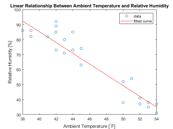
You can see that the fitted line has a negative slope, and as the ambient temperature increases, the relative humidity decreases suggesting an inverse linear relationship.
See Also
Functions
fit(Curve Fitting Toolbox) |thingSpeakRead