plotSlice
Syntax
Description
plotSlice( generates an interactive
figure containing a plot for each predictor variable. Each plot shows the fitted category
probability of the first response category as a function of its corresponding predictor
variable, with the other predictor variables fixed at their sample means. You can customize
the figure by selecting a different response class, changing the values of the fixed
predictors, and selecting a subset of predictor variables.mdl)
plotSlice(___,
specifies additional options using one or more name-value arguments. For example, you can
specify the predictor variables for a histogram.Name=Value)
h = plotSlice(___)Figure object, Histogram array, or
Bar array. Use h to modify the properties of the
figure, histogram, or stacked histogram after you create the plot. For a list of properties,
see Figure, Histogram Properties, or Bar Properties.
Examples
Load the carbig sample data set.
load carbigThe variables Displacement, Weight, and Cylinders contain data for car engine displacement, weight, and number of engine cylinders, respectively.
Fit a multinomial regression model using Displacement and Weight as predictor variables and Cylinders as the response data. Display the vector of response category names.
mdl = fitmnr([Displacement,Weight],Cylinders,PredictorNames=["Displacement","Weight"]);
mdl.ClassNames
ans = 5×1

     3
     4
     5
     6
     8
The output shows that the first category in the vector of response category names corresponds to cars with three engine cylinders.
Generate plots for the probability of a car having three engine cylinders as a function of each predictor variable.
plotSlice(mdl)
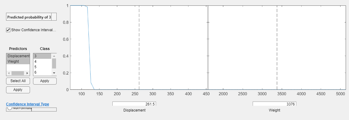
By default, plotSlice displays the probability for the first response category in ClassNames. The two plots for the predictor variables share a vertical axis. The 95% confidence intervals for the predictions are represented by blue shaded regions. However, in the above plots they are very thin. In the left plot, the Weight predictor is fixed at 3376 whereas the Displacement predictor varies. In the right plot, Displacement is fixed at 261.5 whereas Weight varies. The probability of a car having three cylinders is small for all values of Weight when Displacement is 261.5.
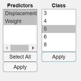
In the Class menu, select 5 then click Apply.
plotSlice updates the plots to display the probability that a car has five engine cylinders.
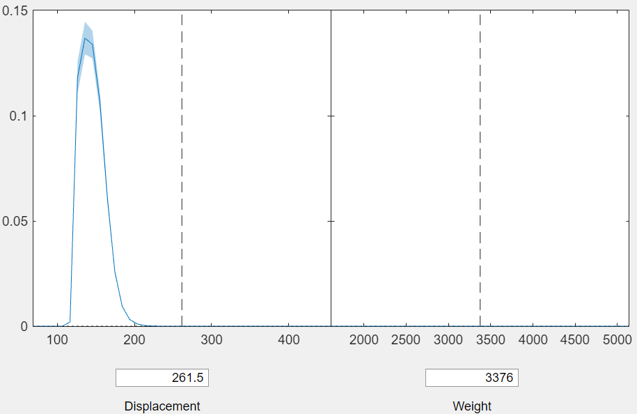
The right plot shows that the probability of a car having five cylinders is also small for all values of Weight when Displacement is 261.5.
To fix Displacement at 150 in the right plot, enter 150 in the Displacement box.
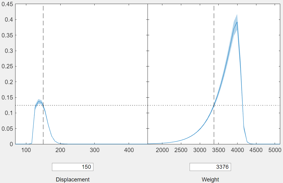
The shared vertical axis automatically rescales to accommodate larger values in the right plot. The right plot shows that when Displacement is fixed at 150, the probability of a car having five engine cylinders peaks when Weight is approximately 4000.
Load the carbig sample data set.
load carbigThe variables Horsepower and Weight contain data for the horsepower and weight of each car. The variable Cylinders contains data for the number of cylinders in each car engine.
Create a table from the data in Horsepower, Weight, and Cylinders by using the table function. Fit a multinomial regression model using Horsepower and Weight as predictors and Cylinders as the response.
tbl = table(Horsepower, Weight, Cylinders, VariableNames=["Horsepower","Weight","Cylinders"]);
mdl = fitmnr(tbl,"Cylinders");
mdl is a MultinomialRegression object that contains the results of fitting a multinomial regression model to the data.
Generate new predictor data.
Horsepower_new = 100:200;
Weight_new = 3000:10:4000;
Xnew = [Horsepower_new' Weight_new'];
Create a slice plot for mdl using the new predictor data for car horsepower and weight.
plotSlice(mdl,Xnew)
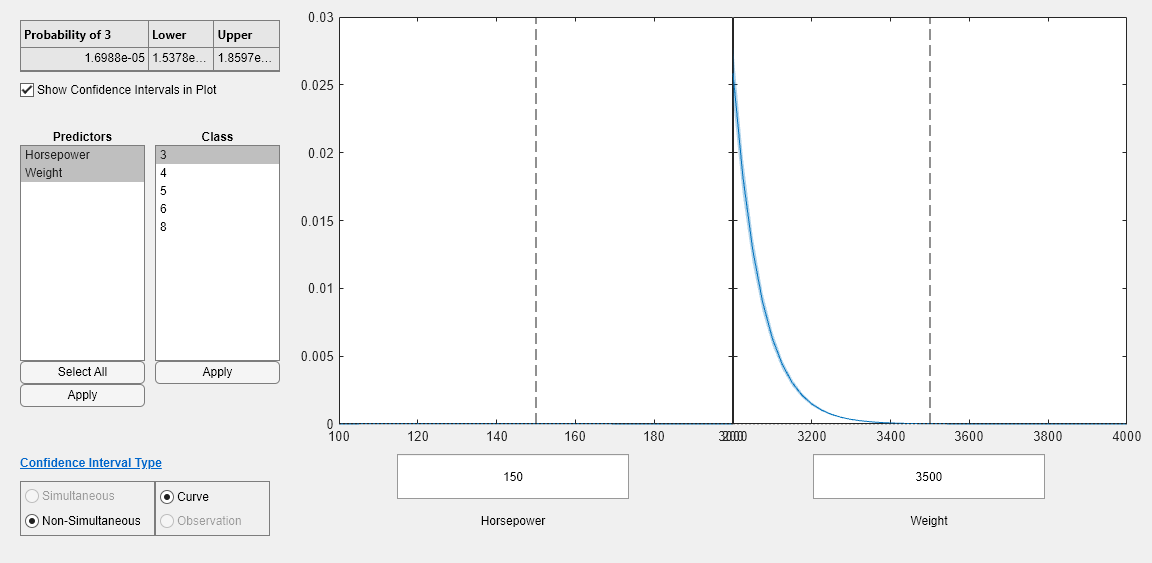
The left plot shows Cylinders as a function of the Horsepower with Weight fixed at 3500. The right plot shows Cylinders as a function of Weight with Horsepower fixed at 150. By default, plotSlice displays the probability for the first response category in ClassNames. You can select a different response category by selecting a different class from the Class menu. The Confidence Interval Type options indicate that the confidence intervals are simultaneous and for the fitted responses. For more information, see Tips.
Load the carbig sample data set.
load carbigThe variables Displacement, Weight, and Cylinders contain data for car engine displacement, weight, and number of engine cylinders, respectively.
Fit a multinomial regression model using Displacement and Weight as predictor variables and Cylinders as the response data. Display the vector of response category names.
mdl = fitmnr([Displacement,Weight],Cylinders,PredictorNames=["Displacement","Weight"]);
mdl.ClassNames
ans = 5×1

     3
     4
     5
     6
     8
The output shows that the response categories correspond to cars with three, four, five, six, and eight engine cylinders.
Display the vector of predictor names.
mdl.PredictorNames
ans = 2×1 cell
    {'Displacement'}
    {'Weight'      }
The output shows that the first predictor in the vector of predictor names corresponds to Displacement.
Generate overlaid histograms of the estimated probabilities for each response category. By default, plotSlice varies the first predictor Displacement and fixes the value of the remaining predictor Weight at its training data mean.
plotSlice(mdl,"histogram")
lgd = legend;
title(lgd,"Number of Cylinders")

The output shows that the probability for each response category peaks in a different interval of Displacement. Cars with higher engine displacement have a higher probability of having more cylinders.
Fix the value of Displacement at the training data mean, and then plot histograms of the response category probabilities for varying Weight.
plotSlice(mdl,"histogram",PredictorToVary="Weight")
lgd = legend;
title(lgd,"Number of Cylinders")

The output shows that a car is most likely to have an engine with six cylinders for all values of Weight. Together, the plots show that the probability of a car being in each category depends on Displacement more than Weight.
Input Arguments
Name-Value Arguments
Specify optional pairs of arguments as
Name1=Value1,...,NameN=ValueN, where Name is
the argument name and Value is the corresponding value.
Name-value arguments must appear after other arguments, but the order of the
pairs does not matter.
Example: plotSlice(mdl,ClassToPlot="setosa") generates an interactive
plot of the setosa response category.
Model Data
Histogram Graphics
Histogram bar color, specified as one of these values:
"none"— Bars are not filled."auto"— The histogram bar color is selected automatically (default).RGB triplet, hexadecimal color code, or color name — Bars are filled with the specified color.
RGB triplets and hexadecimal color codes are useful for specifying custom colors.
An RGB triplet is a three-element row vector whose elements specify the intensities of the red, green, and blue components of the color. The intensities must be in the range
[0,1]; for example,[0.4 0.6 0.7].A hexadecimal color code is a character vector or a string scalar that starts with a hash symbol (
#) followed by three or six hexadecimal digits, which can range from0toF. The values are not case sensitive. Thus, the color codes"#FF8800","#ff8800","#F80", and"#f80"are equivalent.
Alternatively, you can specify some common colors by name. This table lists the named color options, the equivalent RGB triplets, and hexadecimal color codes.
| Color Name | Short Name | RGB Triplet | Hexadecimal Color Code | Appearance |
|---|---|---|---|---|
"red" | "r" | [1 0 0] | "#FF0000" |
|
"green" | "g" | [0 1 0] | "#00FF00" |
|
"blue" | "b" | [0 0 1] | "#0000FF" |
|
"cyan"
| "c" | [0 1 1] | "#00FFFF" |
|
"magenta" | "m" | [1 0 1] | "#FF00FF" |
|
"yellow" | "y" | [1 1 0] | "#FFFF00" |
|
"black" | "k" | [0 0 0] | "#000000" |
|
"white" | "w" | [1 1 1] | "#FFFFFF" |
|
Here are the RGB triplets and hexadecimal color codes for the default colors MATLAB® uses in many types of plots.
| RGB Triplet | Hexadecimal Color Code | Appearance |
|---|---|---|
[0 0.4470 0.7410] | "#0072BD" |
|
[0.8500 0.3250 0.0980] | "#D95319" |
|
[0.9290 0.6940 0.1250] | "#EDB120" |
|
[0.4940 0.1840 0.5560] | "#7E2F8E" |
|
[0.4660 0.6740 0.1880] | "#77AC30" |
|
[0.3010 0.7450 0.9330] | "#4DBEEE" |
|
[0.6350 0.0780 0.1840] | "#A2142F" |
|
Example: FaceColor="g"
Data Types: single | double | char | string
Transparency of histogram bars, specified as a scalar value between
0 and 1 inclusive.
plotSlice uses the same transparency for all the bars of the
histogram. A value of 1 means fully opaque and 0
means completely transparent (invisible).
Example: FaceAlpha=1
Data Types: single | double
Width of bar outlines, specified as a positive value in point units. One point equals 1/72 inch.
Example: LineWidth=1.5
Data Types: single | double
Note
The graphics properties for histograms listed here are only a subset. For a complete list, see Histogram Properties.
Stacked Histogram Graphics
Outline color, specified as "flat", an RGB triplet, a hexadecimal color
code, a color name, or a short name. If the plot has 150 bars or fewer, the
default value is [0 0 0], which corresponds to black. If
the plot has more than 150 adjacent bars, the default value is
"none".
For a custom color, specify an RGB triplet or a hexadecimal color code.
An RGB triplet is a three-element row vector whose elements specify the intensities of the red, green, and blue components of the color. The intensities must be in the range
[0,1], for example,[0.4 0.6 0.7].A hexadecimal color code is a character vector or a string scalar that starts with a hash symbol (
#) followed by three or six hexadecimal digits, which can range from0toF. The values are not case sensitive. Therefore, the color codes"#FF8800","#ff8800","#F80", and"#f80"are equivalent.
Alternatively, you can specify some common colors by name. This table lists the named color options, the equivalent RGB triplets, and hexadecimal color codes.
| Color Name | Short Name | RGB Triplet | Hexadecimal Color Code | Appearance |
|---|---|---|---|---|
"red" | "r" | [1 0 0] | "#FF0000" |
|
"green" | "g" | [0 1 0] | "#00FF00" |
|
"blue" | "b" | [0 0 1] | "#0000FF" |
|
"cyan" | "c" | [0 1 1] | "#00FFFF" |
|
"magenta" | "m" | [1 0 1] | "#FF00FF" |
|
"yellow" | "y" | [1 1 0] | "#FFFF00" |
|
"black" | "k" | [0 0 0] | "#000000" |
|
"white" | "w" | [1 1 1] | "#FFFFFF" |
|
"none" | Not applicable | Not applicable | Not applicable | No color |
Here are the RGB triplets and hexadecimal color codes for the default colors MATLAB uses in many types of plots.
| RGB Triplet | Hexadecimal Color Code | Appearance |
|---|---|---|
[0 0.4470 0.7410] | "#0072BD" |
|
[0.8500 0.3250 0.0980] | "#D95319" |
|
[0.9290 0.6940 0.1250] | "#EDB120" |
|
[0.4940 0.1840 0.5560] | "#7E2F8E" |
|
[0.4660 0.6740 0.1880] | "#77AC30" |
|
[0.3010 0.7450 0.9330] | "#4DBEEE" |
|
[0.6350 0.0780 0.1840] | "#A2142F" |
|
Example: EdgeColor="red"
Example: EdgeColor=[0.6350 0.0780 0.1840]
Example: EdgeColor="#D2F9A7"
Data Types: single | double | char | string
Line style, specified as one of the options listed in this table.
| Line Style | Description | Resulting Line |
|---|---|---|
"-" | Solid line |
|
"--" | Dashed line |
|
":" | Dotted line |
|
"-." | Dash-dotted line |
|
"none" | No line | No line |
Example: LineStyle="--"
Data Types: char | string
Note
The graphics properties for stacked histograms listed here are only a subset. For a complete list, see Bar Properties.
Output Arguments
Version History
Introduced in R2023aSee Also
MultinomialRegression | fitmnr | Figure | Histogram Properties | Bar Properties