Design Custom Buttons
This example shows how to use the Push Button and Callback Button blocks from the Customizable Blocks library to design the button panel of an elevator, including:
Buttons that specify the floor you want to travel to
Buttons that open and close the elevator doors
An alarm button
To push the virtual button that a Push Button or Callback Button block represents during simulation, click the block. While you press your pointer, the button is pushed. When you release your pointer, you release the button.
You can use callback functions to specify what you want the buttons to do:
PressFcnfunctions run while the button is pushed. You can configure aPressFcnfunction to run only once while the button is pushed, or you can specify a repeat interval.ClickFcnfunctions run when you release the button.
In this example, you use ClickFcn functions to display messages about the actions of an elevator in the MATLAB® Command Window.
You can configure a Push or Callback Button block to represent a latched button. A latched button stays pushed when you release your pointer. Once configured, to latch the button during simulation, click the block. To unlatch the button, click the block again. The PressFcn function runs while the button is latched. The ClickFcn function runs once when you latch the button and once when you unlatch the button.
In this example, you configure the elevator floor buttons and the alarm button as latched buttons because real floor and alarm buttons typically stay lit when you release them.
You can use states to specify how the appearance of the Push Button or Callback Button block changes when you interact with a button:
While you push the button, the block is in the
Pressedstate.When the button is latched and you are not pushing it, the block is in the
Latchedstate.When a button is latched and you are pushing it, the block is in the
Latched and Pressedstate.When a block is not in any of these three states, it is in the
Defaultstate.
The states pair pointer actions with:
A state label
A state icon
A state image
For the Push Button block, the Pressed, Latched, and Latched and Pressed states also pair pointer actions with an On Value. The On Value is the same for these three states. When you enter one of these states, the On Value is assigned to the Simulink® component to which the Push Button block connects.
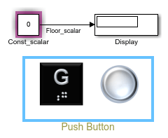
In this example, you create buttons that control the floor to which an elevator travels by assigning their On Value to a Constant block.
Design Elevator Ground Floor Button with Push Button Block
In this example, you use the Push Button block to model the ground floor button of an elevator.
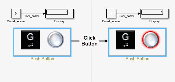
When you push the ground floor button:
The button lights up.
The value of a Constant block changes.
The MATLAB Command Window displays a message that states to which floor the elevator is traveling.
The ground floor button is modeled using the Push Button block because Push Button blocks are designed to control a parameter value. Callback Button blocks do not connect to a block and can only control a block parameter value using callback functions, which adds complexity to the model.
To create the ground floor button, add a Push Button block from the Customizable Blocks library to the model using the Simulink quick insert menu:
To open the quick insert menu, double-click the canvas.
To search for the Push Button block, type
Push Button.Select the search result with the library path
Simulink/Dashboard/Customizable Blocks.
When you press an elevator floor button in a real elevator, the button stays lit when you release it. To implement this behavior on the Push Button block:
In the Simulink Toolstrip, on the Modeling tab, under Design, select Property Inspector.
In the Property Inspector, on the Parameters tab, in the Main section, for Button Type, select
Latch.
The elevator button now has four states: Default, Pressed, the Latched, and Pressed and Latched state:
In the
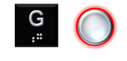
Defaultstate, the elevator floor button is not lit.In the other states, the elevator floor button is lit.
Each state has an image that can be used to show whether the elevator button is lit.
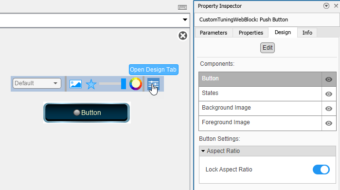
To modify the state images of the Push Button block, enter design mode:
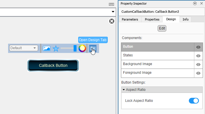
If the Push Button block is not selected, select the block.
In the Simulink Toolstrip, in the Button tab, click Edit.
In the toolbar that appears above the block, click Open Design Tab.
Adding state images to a customizable dashboard block changes the aspect ratio of the state images to match the aspect ratio of the block.
Adding a background image to a customizable dashboard block changes the aspect ratio of the block to match the aspect ratio of the background image.
To prevent state images from being distorted, before you configure the button states, you can use a background image to set the aspect ratio of the block to be the same as the aspect ratio of the state image. In this model, the background image both sets the aspect ratio and shows the label of the elevator floor button.
Add the background image for the elevator floor buttons:
On the Design tab, select the Background Image component.
In the Select Image section, click the plus button.
In the
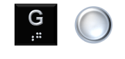
CustomButtonImagesfolder, select theelevator-button-floor-G.pngfile.
Note that the new background image is not visible because the default state icon and image are covering it, but the aspect ratio of the block has changed.
Configure the appearance of the button for the Default state:
In the Property Inspector, on the Design tab, open the States component.
In the Icon section, click the
X.In the Image section, click the plus button.
In the
CustomButtonImagesfolder, select theelevator-button-off.pngfile.Set the X Offset and Y Offset to
0.Set the Width and Height to
1.Since the image already indicates which elevator button is being modeled, the button label text is not needed. In the Label section, delete the default Text.
To configure the appearance of the button for the Pressed, Latched, and Latched and Pressed states, for each state:
In the Property Inspector, on the Design tab, open the States component.
In the Select State section, select the state.
In the Icon section, click the
X.In the Image section, click the plus button.
In the
CustomButtonImagesfolder, select theelevator-button-on.pngfile.Set the X Offset to
0.To make the button look like it is pushed down, set the Y Offset to
0.025.Set the Width and Height to
1.In the Label section, delete the default Text.
In the Label section, verify that the X Offset and Y Offset are set to
0. If they are not, set them to0.
The appearance of the ground floor button is now fully configured. To exit design mode, in the Property Inspector, on the Design Tab, click Edit.
When the Push Button block enters a state, the On Value of the block is assigned to the Simulink block diagram element to which the Push Button block connects. In this example, the ground floor button controls the value of a Constant block with a scalar value that tracks the destination of the elevator:
When the value is
0, the elevator is not traveling to the ground floor.When the value is
1, the elevator is traveling to the ground floor.
To implement this behavior, set the value of the Const_scalar block to 0, and the On Value of the ground floor button to 1:
In the model, the value of the
Const_scalarblock is already set to0.You can specify the On Value in the Property Inspector, on the Parameters tab, in the Main section. For this example, the On Value is
1by default.
To connect the ground floor button to the Const_scalar block:
Select the Push Button block.
Click the Connect button that appears above the block.
Select the
Const_scalarblock.In the table that appears below the selected signal, select
Const_scalar:Value.Click the
Xin the upper right corner of the Simulink window.To check the connection, select the Push Button block. If the Constant block is connected, it is highlighted in purple.
You can use a callback function to display the floor that the elevator is headed to in the MATLAB Command Window when you push the ground floor button.
Let status_scalar be the variable that the callback function uses to track whether or not the elevator button is lit:
When the button is lit, the value is
1.When the button is not lit, the value is
0.
Note that status_scalar is different from and does not affect the On Value of the Push Button block.
Set up a preload callback function that automatically initializes status_scalar to a value of 0 when you open the model:
Right-click the model canvas, and then click the Model Properties button.
On the Callbacks tab, in the PreLoadFcn section, enter this command and click OK.
status_scalar=0;
Save and re-open the model. When the model loads, the preload function runs.
Write the callback function to display which floor the elevator is heading to when the button is clicked:
Click the Push Button block to select the block.
In the Property Inspector, on the Parameters tab, in the Callbacks section, from the list, select
ClickFcn.In the Callbacks section, enter these commands.
if(status_scalar<1)
    status_scalar=1;
    disp('Elevator is headed to ground floor');
else
    status_scalar=0;
end
Elevator is headed to ground floor
To use the ground floor button during simulation, run the model and click the block. When the button lights up, the MATLAB Command Window displays the message Elevator is headed to ground floor.
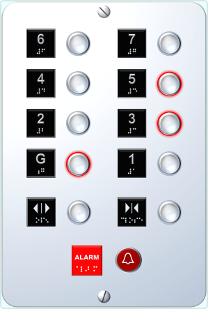
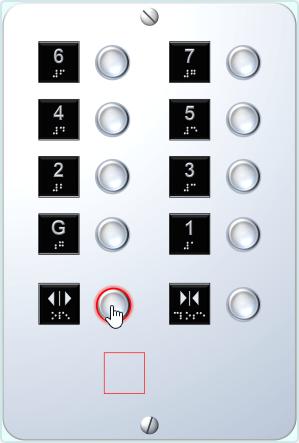
Design Elevator Button Panel
In this example, you use the ground floor button from the previous section to create an elevator button panel with eight floor buttons. The panel includes one ground button and the buttons for floors one to seven.
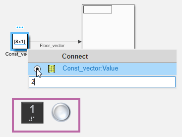
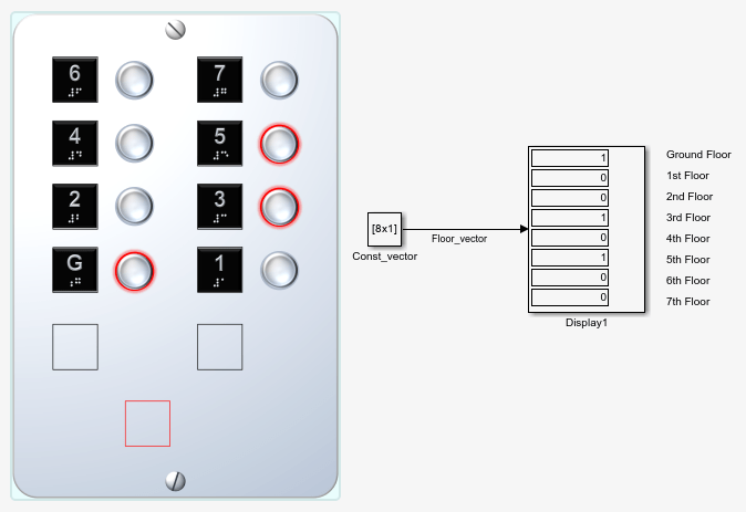
Before creating the buttons, consider how you connect the buttons with the block parameter value that they control. When you have many elevator floor buttons, connecting each one to a separate Constant block with a scalar Constant value adds complexity to the model structure. Instead, you can connect all elevator buttons to a single Constant block with a Constant value that is a vector. Each button controls one element in the vector.
In the model, the Constant block named Const_vector has a Constant value that is a vector with eight elements, one for every floor. The value of each element is initialized to zero.
Connect the Push Button to Const_vector:
Select the Push Button block for the ground floor.
Click the Connect button that appears above the block.
Select the Constant block named
Const_vector.In the table that appears below the selected signal, select
Const_vector:Value.To indicate the vector element that corresponds to the ground floor, in the text box at the bottom of the Connect dialog box, enter 1.
Click the
Xin the upper right corner of the Simulink window.
Each button needs its own callback function variable to track the button status. Let these variables all be elements of a vector: the status_vector.
Use a preload callback function to initialize the value of the status_vector so that it is automatically initialized to zeros(8,1) when you open the model:
Right-click the model canvas, and then click the Model Properties button.
On the Callbacks tab, in the PreLoadFcn section, enter this command and click OK.
status_vector=zeros(8,1);
Save and reopen the model.
Change the callback function of the Push Button for the ground floor to track the status of the ground floor button with the first element of the status_vector.
floor=0;
i_floor=floor+1;
if(status_vector(i_floor)<1)
    status_vector(i_floor)=1;
    disp('Elevator is headed to ground floor');
else
    status_vector(i_floor)=0;
end
Elevator is headed to ground floor
To create the elevator buttons for floors one through seven, for each button:
Copy and paste the ground floor button.
Select the copy.
To enter design mode, in the Property Inspector, on the Design tab, click Edit.
In the Background Image component, in the Select Image section, click the green plus button.
In the
CustomButtonImagesfolder, select theelevator-button-floor-N.pngfile, whereNis the number of the floor. In the Property Inspector, on the Parameters tab, in the Callbacks section, change the value offloortoN.Also in the Callbacks section, change the message that is displayed when the elevator button lights up to indicate that the elevator is traveling to floor
N.To exit design mode, click the
Xin the upper right corner of the canvas.Select the Push Button block.
Click the Connect button that appears above the block.
Select the Constant block named
Const_vector.In the table that appears below the selected signal, select
Const_vector:Value.In the text box at the bottom of the Connect dialog box, enter
N+1.Click the
Xin the upper right corner of the Simulink window.
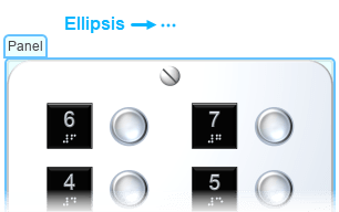
The elevator floor buttons are mounted to a panel on the wall. Create a Simulink panel:
Create a copy of the ground floor button.
Select the copy.
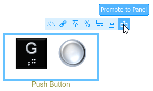
Click the ellipsis that appears above the block and select Promote to Panel.
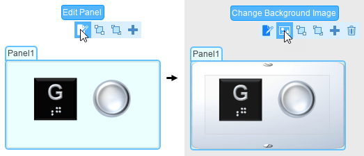
Add a background image to the panel:
Select the panel.
To enter panel edit mode, click the ellipsis that appears above the panel and select Edit Panel.
In the action menu that appears, select Change Background Image.
In the
CustomButtonImagesfolder, select theelevator-button-panel-background.pngfile.Resize the panel to make it large enough to fit eleven buttons in six rows and two columns by clicking and dragging one of the panel corners. Resizing can also change the aspect ratio of the panel. Size the panel such that the screw heads in the panel background image are circular.
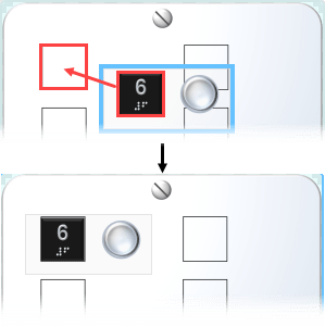
Add the other seven floor buttons to the panel: click and drag each button onto the panel to add it.
Resize and position the buttons so that the floor number plates exactly cover the empty squares on the panel background image. To resize a button, select the block modeling that button, then click and drag one of its corners. To position a button, select the button, then use the arrow keys to move it.
To exit panel edit mode, in the action menu above the panel, select Done Editing.
To use a button on the panel during simulation, run the model and click the block representing the button. When the button lights up, the MATLAB Command Window displays the message you entered in the callback function of that button.
Design Elevator Door Buttons with Callback Button Blocks
In this example, you use the Callback Button block to model the door buttons of an elevator. Unlike the elevator floor buttons, the door buttons are not used to control a value.
When you click or press the door buttons:
The door buttons light up and stay lit until you release the click.
The MATLAB Command Window displays a message that states whether the doors are opening or closing.
To design the button that opens the elevator door, add a Callback Button block from the Customizable Blocks library to the model.
The door buttons only stay lit until you release the click. Whether the buttons stay in the nondefault states when you release the click or not depends on the Button Type. The Button Type for the door button is Momentary, meaning that the buttons revert to the default state when you release the click.
Check the Button Type of the Callback Button block:
Select the Callback Button block.
If the Property Inspector is not open, in the Simulink Toolstrip, on the Modeling tab, under Design, select Property Inspector.
In the Main section, Button Type is set to
Momentaryby default.
The door button has two states, Default and Pressed:
In the
Default, the elevator door button is not lit.In the
Pressed, the elevator door button is lit.
Each state has an image that can be used to show whether the door button is lit. To modify the state images of the Callback Button block, enter design mode:
If the Callback Button block is not selected, select the block.
In the Simulink Toolstrip, in the Button tab, click Edit.
In the toolbar that appears above the block, click Open Design Tab.
Adding state images to a block from the Customizable Blocks library changes the aspect ratio of the state images to match the aspect ratio of the block.
Adding a background image to a block from the Customizable Blocks library changes the aspect ratio of the block to match the aspect ratio of the background image.
To prevent state images from being distorted, before you configure the button states, you can use a background image to set the aspect ratio of the block to be the same as the aspect ratio of the state image.
In this model, the background image both sets the aspect ratio and shows the label of the elevator door button.
Add the background image for the door buttons:
On the Design tab, select the Background Image component.
In the Select Image section, click the plus button.
In the
CustomButtonImagesfolder, select theelevator-button-open-door.pngfile.

Note that the new background image is not visible because the default state icon and image are covering it, but the aspect ratio of the block has changed.
Configure the appearance of the button for the default state:
In the Property Inspector, on the Design tab, open the States component.
In the Icon section, click the
X.In the Image section, click the plus button.
In the
CustomButtonImagesfolder, select theelevator-button-off.pngfile.Set the X Offset and Y Offset to
0.Set the Width and Height to
1.Since the image already indicates which elevator button is being modeled, the button label text is not needed. In the Label section, delete the default Text.
To configure the appearance of the button for the pressed state:
In the States Component, in the Select State section, select the type of state.
In the Icon section, click the
X.In the Image section, click the plus button.
In the
CustomButtonImagesfolder, select theelevator-button-on.pngfile.Set the X Offset to
0.To make the button look like it is pushed down, set the Y Offset to
0.025.Set the Width and Height to
1.In the Label section, delete the default Text.
In the Label section, set the X Offset and Y Offset to
0.

The appearance of the button that opens the elevator door is now fully configured. To exit design mode, in the Property Inspector, on the Design Tab, click Edit.
You can use a callback function to display in the MATLAB Command Window that the elevator door is opening in after you click it.
Write the callback function to display that the elevator door is opening after the button is clicked:
In the Property Inspector, on the Parameters tab, in the Callbacks section, from the list, select
ClickFcn.In the Callbacks section, enter these.
disp('Elevator doors are opening');
Elevator doors are opening
The button that opens the elevator door is now fully configured.
To create the button that closes the elevator door:
Drag a selection box around the Callback Button block representing the button for opening the elevator door. Use your keyboard to copy and paste the block.
Drag a selection box around the copy.
To enter design mode, in the Property Inspector, on the Design tab, click Edit.
In the Background Image component, in the Select Image section, click the green plus button.
In the
CustomButtonImagesfolder, select theelevator-button-close-door.pngfile.In the Property Inspector, on the Parameters tab, in the Callbacks section, change the message that is displayed when the elevator button lights up to indicate that the doors are closing.
The buttons that open and close the elevator doors are now fully configured.
Add the door buttons to the elevator button panel:
Select the panel.
To enter panel edit mode, click the ellipsis that appears above the panel and select Edit Panel.
Click and drag the door buttons onto the panel.
Position the door buttons in a row beneath the other buttons. Leave space at the bottom for one more button to complete the next section of the example.
If needed, resize the buttons to fit them on the panel. To resize a button, select the block that models the button and then click and drag one of its corners.
To exit panel edit mode, in the action menu above the panel, select Done Editing.
To use the door buttons during simulation, run the model and click the Callback blocks representing the door buttons. When a door button lights up, the MATLAB Command Window displays a message that states whether the elevator doors are opening or closing.
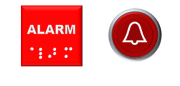
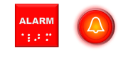
Design Elevator Alarm Button with Callback Button Block
In this example, you use the Callback Button block to model the alarm button of an elevator:
When you click or press the alarm button, it lights up and stays lit after you release the click.
When you click or press the door buttons, the MATLAB Command Window displays the message
Alarm!.
Unlike the elevator floor buttons, the alarm button is not used to control a value.
To design the alarm button, add a Callback Button block from the Customizable Blocks library to the model.
When you press the alarm button in a real elevator, the button stays lit even when you release it. To implement this behavior on the Callback Button block:
Select the Callback Button block.
If the Property Inspector is not open, in the Simulink Toolstrip, on the Modeling tab, under Design, select Property Inspector.
In the Property Inspector, on the Parameters tab, in the Main section, for Button Type, select
Latch.
The elevator button now has four states: Default, Pressed, Latched, and Pressed and Latched.
In the
Defaultstate, the elevator alarm button is not lit.In the other states, the elevator alarm button is lit.
Each state has an image that can be used to show whether the elevator button is lit. To modify the state images of the Callback Button block, enter design mode:
If the Callback Button block is not selected, select the block.
In the Simulink Toolstrip, in the Button tab, click Edit.
In the toolbar that appears above the block, click Open Design Tab.
Adding state images to a customizable dashboard block changes the aspect ratio of the state images to match the aspect ratio of the block.
Adding a background image to a customizable dashboard block changes the aspect ratio of the block to match the aspect ratio of the background image.
To prevent state images from being distorted, before you configure the button states, you can use a background image to set the aspect ratio of the block to be the same as the aspect ratio of the state image.
In this model, the background image both sets the aspect ratio and shows the label of the alarm button.
Add the background image for the alarm buttons:
On the Design tab, select the Background Image component.
In the Select Image section, click the plus button.
In the
CustomButtonImagesfolder, select theelevator-button-alarm.pngfile.
Note that the new background image is not visible because the default state icon and image are covering it, but the aspect ratio of the block has changed.
Configure the appearance of the button for the Default state:
In the Property Inspector, on the Design tab, open the States component.
In the Icon section, click the plus button.
In the
CustomButtonImagesfolder, select theelevator-button-alarm-icon.pngfile.Set the Width and Height to
1.In the Image section, click the plus button.
In the
CustomButtonImagesfolder, select theelevator-button-alarm-off.pngfile.Set the X Offset and Y Offset to
0.Set the Width and Height to
1.Since the image already indicates which elevator button is being modeled, the button label text is not needed. In the Label section, delete the default Text.
To configure the appearance of the button for the Pressed state:
In the States Component, in the Select State section, select the type of state.
In the Icon section, click the plus button.
In the
CustomButtonImagesfolder, select theelevator-button-alarm-icon.pngfile.Set the Width and Height to
1.In the Image section, click the plus button.
In the
CustomButtonImagesfolder, select theelevator-button-alarm-off.pngfile.Set the X Offset to
0.To make the button look like it is pushed down, set the Y Offset to
0.025.Set the Width and Height to
1.In the Label section, delete the default Text.
In the Label section, set the X Offset to
0.To keep the state icon centered on the state image, set the Y Offset to
0.025.
The appearance of the alarm button is now fully configured. To exit design mode, in the Property Inspector, on the Design Tab, click Edit.
You can use a callback function to display in the MATLAB Command Window that the elevator door is opening when you click or press the button and the button lights up.
Let status_a be the variable that the callback function uses to track whether or not the elevator button is lit:
When the button is lit, the value is
1.When the button is not lit, the value is
0.
Set up a preload callback function that automatically initializes status_a to a value of 0 when you open the model:
Right-click the model canvas, and then click the Model Properties button.
On the Callbacks tab, in the PreLoadFcn section, enter this command and click OK.
status_a=0;
Save and reopen the model. When the model loads, the preload function runs.
Write the callback function to display that the elevator door is opening when the button is clicked:
In the Property Inspector, on the Parameters tab, in the Callbacks section, from the list, select
ClickFcn.In the Callbacks section, enter these commands.
if(status_a<1)
    status_a=1;
    disp('Alarm!');
else
    status_a=0;
end
Alarm!
The elevator alarm button is now fully configured.
Add the alarm button to the elevator button panel:
Select the panel.
To enter panel edit mode, click the ellipsis that appears above the panel and select Edit Panel.
Click and drag the alarm button onto the panel.
Position the alarm button beneath the other buttons.
If needed, resize the buttons to fit them on the panel. To resize a button, select the block modeling that button, then click and drag one of its corners.
To exit panel edit mode, in the action menu above the panel, select Done Editing.
To use the alarm button during simulation, run the model and click the Callback block representing the alarm button. When the button lights up, the MATLAB Command Window displays the message Alarm!.
