plot
Plot parameter confidence interval results
Description
fh = plot(paraCI)paraCI, a ParameterConfidenceInterval object or vector of objects.
If the estimation status of a confidence interval (
paraCI.Results.Status) issuccess, theplotfunction uses the first default color (blue) to plot a line and a centered dot for every parameter estimate. The function also plots a box to indicate the confidence intervals.If the status is
constrainedorestimable, the function uses the second default color (red) and plots a line, centered dot, and box to indicate the confidence intervals.If the status is
not estimable, the function plots only a line and a centered cross in red.If there are any transformed parameters with estimated values that are 0 (for the
logtransform) and 0 or 1 (for theprobitorlogittransform), no confidence intervals are plotted for those parameter estimates.
fh = plot(paraCI,Name,Value)Name,Value
pair arguments.
Examples
Load Data
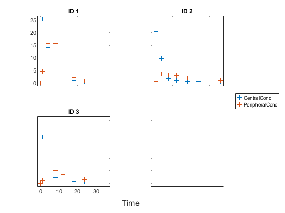
Load the sample data to fit.
load data10_32R.mat
gData = groupedData(data);
gData.Properties.VariableUnits = ["","hour","milligram/liter","milligram/liter"];
sbiotrellis(gData,"ID","Time",["CentralConc","PeripheralConc"], ...
            Marker="+",LineStyle="none");
Create Model
Create a two-compartment model.
pkmd                 = PKModelDesign;
pkc1                 = addCompartment(pkmd,"Central");
pkc1.DosingType      = "Infusion";
pkc1.EliminationType = "linear-clearance";
pkc1.HasResponseVariable = true;
pkc2                 = addCompartment(pkmd,"Peripheral");
model                = construct(pkmd);
configset            = getconfigset(model);
configset.CompileOptions.UnitConversion = true;
Define Dosing
Define the infusion dose.
dose             = sbiodose("dose","TargetName","Drug_Central");
dose.StartTime   = 0;
dose.Amount      = 100;
dose.Rate        = 50;
dose.AmountUnits = "milligram";
dose.TimeUnits   = "hour";
dose.RateUnits   = "milligram/hour";
Define Parameters
Define parameters to estimate.
responseMap = ["Drug_Central = CentralConc","Drug_Peripheral = PeripheralConc"];
paramsToEstimate   = ["log(Central)","log(Peripheral)","Q12","Cl_Central"];
estimatedParam     = estimatedInfo(paramsToEstimate,...
                                   InitialValue=[1 1 1 1],...
                                   Bounds=[0.1 3;0.1 10;0 10;0.1 2]);
Fit Model
Perform an unpooled fit, that is, one set of estimated parameters for each patient.
unpooledFit = sbiofit(model,gData,responseMap,estimatedParam,dose,Pooled=false);
Perform a pooled fit, that is, one set of estimated parameters for all patients.
pooledFit = sbiofit(model,gData,responseMap,estimatedParam,dose,Pooled=true);
Compute Confidence Intervals for Estimated Parameters
Compute 95% confidence intervals for each estimated parameter in the unpooled fit using the Gaussian approximation.
ciParamUnpooled = sbioparameterci(unpooledFit);
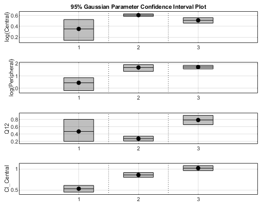
Plot the confidence intervals. If the estimation status of a confidence interval is success, it is plotted in blue (the first default color). Otherwise, it is plotted in red (the second default color), which indicates that further investigation into the fitted parameters might be required. If the confidence interval is not estimable, then the function plots a red line and centered cross. If there are any transformed parameters with estimated values that are 0 (for the log transform) and 1 or 0 (for the probit or logit transform), then no confidence intervals are plotted for those parameter estimates. To see the color order, type get(groot,'defaultAxesColorOrder').
Groups are displayed from left to right in the same order that they appear in the GroupNames property of the object, which is used to label x-axis. The y-labels are the transformed parameter names.
plot(ciParamUnpooled)

Plot using a single color.
plot(ciParamUnpooled,Color=[0 0 0])
Compute the confidence intervals for the pooled fit.
ciParamPooled = sbioparameterci(pooledFit);
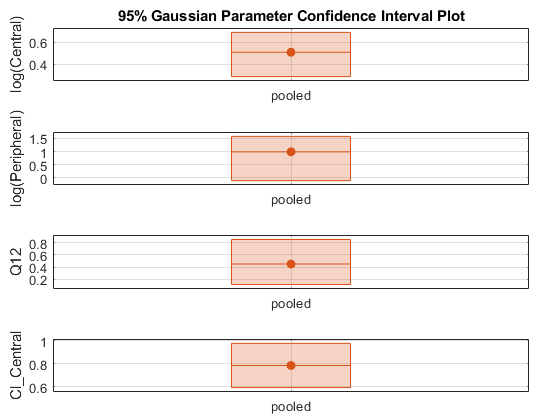
Plot the confidence intervals. The group name is labeled as "pooled" to indicate such fit.
plot(ciParamPooled)
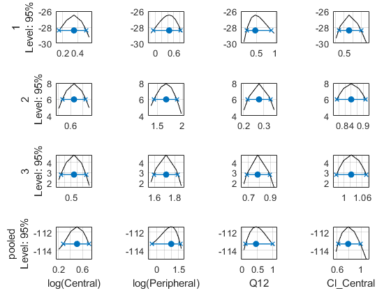
Plot all the confidence interval results together. By default, the confidence interval for each parameter estimate is plotted in a separate axes. Vertical dotted lines group confidence intervals of parameter estimates that were computed in a common fit. Parameter bounds defined in the original fit are marked by square brackets (if visible in the parameter range being plotted).
ciAll = [ciParamUnpooled;ciParamPooled];
plot(ciAll)

You can also plot all confidence intervals on one axes grouped by parameter estimates using the 'Grouped' layout.
plot(ciAll,Layout="Grouped")
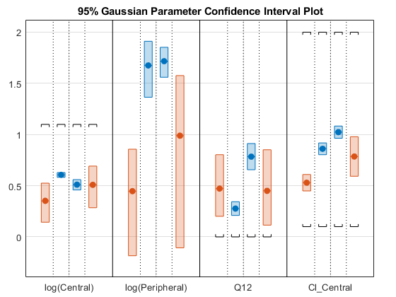
In this layout, you can point to the center marker of each confidence interval to see the group name. Each estimated parameter is separated by a vertical black line. Vertical dotted lines group confidence intervals of parameter estimates that were computed in a common fit. Parameter bounds defined in the original fit are marked by square brackets (if visible in the parameter range being plotted). Note the different scales on the y-axis due to parameter transformations. For instance, the y-axis of Q12 is in the linear scale, but that of Central is in the log scale due to its log transform.
Compute Confidence Intervals Using Profile Likelihood
Compute 95% confidence intervals for each estimated parameter in the unpooled fit using the profile likelihood approach.
ciParamUnpooledProf = sbioparameterci(unpooledFit,Type="profilelikelihood");
Compute the confidence intervals for the pooled fit.
ciParamPooledProf = sbioparameterci(pooledFit,Type="profilelikelihood");
Plot the negative profile likelihood curves for the unpooled fit. The parameter bounds defined in the original fit are displayed by vertical dotted lines (if visible in the parameter range being plotted). The confidence interval is indicated by two crosses and a line in between them. The center dot denotes the parameter estimate. The profile likelihood is always plotted in the log scale. The x-axis scale depends on whether the parameter is transformed (log, probit, or logit scale) or not (linear scale).
plot(ciParamUnpooledProf,ProfileLikelihood="negative");
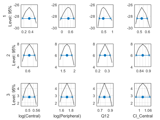
Each group is plotted in a separate row, and each parameter is plotted in a separate column.
Plot the curves for the pooled fit.
plot(ciParamPooledProf,ProfileLikelihood="negative");

Plot all the confidence interval results together in the same figure.
plot([ciParamUnpooledProf;ciParamPooledProf],ProfileLikelihood="negative");
Input Arguments
Parameter confidence interval results, specified as a ParameterConfidenceInterval object or a vector of
objects.
Name-Value Arguments
Specify optional pairs of arguments as
Name1=Value1,...,NameN=ValueN, where Name is
the argument name and Value is the corresponding value.
Name-value arguments must appear after other arguments, but the order of the
pairs does not matter.
Example: ProfileLikelihood="negative" specifies to plot the
negative profile likelihood curves.
Red-Green-Blue color triplet, specified as a three-element row vector.
By default, confidence intervals that are not limited by the parameter
bounds specified in the original fit are plotted using the first default
color (blue), and those that are limited by the bounds are plotted using
the second default color (red). If the confidence interval is not
estimable, it is also plotted in red. To see the default color order,
enter get(groot,"defaultAxesColorOrder") or see the
ColorOrder property.
Tip
Use this name-value pair when you want to create plots with a single color, for instance, for publication purposes.
Example: Color=[0 0 0]
Control to display profile likelihood curves for the
profileLikelihood confidence intervals, specified
as one of the following:
falseor"none"— Does not show the profile likelihood curves.trueor"positive"— Shows the positive profile likelihood curves."negative"— Shows the negative profile likelihood curves.
The confidence interval is indicated by two crosses with a line in
between them. A center dot denotes the parameter estimate. The
plot function uses the first default color
(blue) for successfully computed confidence intervals. Otherwise, the
function uses the second default color (red). A vertical dotted line
marks the parameter bounds defined in the original fit.
If there are multiple groups, each group is plotted in a separate row
and each parameter is plotted in a separate column. The labels for the
x-axis are the transformed parameter names (the
TransformedName property of the
estimatedInfo object used in the original fit). The
labels for the y-axis are the group names (the
GroupNames property of the confidence interval
object) and the confidence level.
The profile likelihood curve is always plotted in the log scale. The x-axis scale depends on whether the parameter is transformed (log, probit, or logit scale) or not (linear scale).
Example: ProfileLikelihood="negative"
Axes layout to display parameter confidence intervals, specified as
"split" or "grouped".
The default "split" layout displays the confidence
interval for each parameter estimate on a separate axes.
The "grouped" layout displays all confidence
intervals on one axes grouped by parameter estimates. Each estimated
parameter is separated by a vertical black line.
In both cases, the parameter bounds defined in the original fit are marked by square brackets. The function uses vertical dotted lines to group confidence intervals of parameter estimates that have been computed in a common fit.
Example: Layout="grouped"
Output Arguments
Figure handle of the plot, returned as a figure handle.
Version History
Introduced in R2017bThe function shows the profile likelihood curve that is two times the log
likelihood (2*LL or -2*LL). Previously, the
plot showed the log likelihood (LL or -LL) instead.
The argument has three additional values and two of them are equal to existing values.
"none"— Same asfalse. The function does not show the profile likelihood curves."positive"— Same astrue. The function shows the positive profile likelihood curves."negative"— Shows the negative profile likelihood curves.
See Also
MATLAB Command
You clicked a link that corresponds to this MATLAB command:
Run the command by entering it in the MATLAB Command Window. Web browsers do not support MATLAB commands.
웹사이트 선택
번역된 콘텐츠를 보고 지역별 이벤트와 혜택을 살펴보려면 웹사이트를 선택하십시오. 현재 계신 지역에 따라 다음 웹사이트를 권장합니다:
또한 다음 목록에서 웹사이트를 선택하실 수도 있습니다.
사이트 성능 최적화 방법
최고의 사이트 성능을 위해 중국 사이트(중국어 또는 영어)를 선택하십시오. 현재 계신 지역에서는 다른 국가의 MathWorks 사이트 방문이 최적화되지 않았습니다.
미주
- América Latina (Español)
- Canada (English)
- United States (English)
유럽
- Belgium (English)
- Denmark (English)
- Deutschland (Deutsch)
- España (Español)
- Finland (English)
- France (Français)
- Ireland (English)
- Italia (Italiano)
- Luxembourg (English)
- Netherlands (English)
- Norway (English)
- Österreich (Deutsch)
- Portugal (English)
- Sweden (English)
- Switzerland
- United Kingdom (English)