Create Classification Map from Table Data
The example shows how to create a classification map from spatial and attribute data contained in tables. A classification map indicates the values of classified or categorical attributes within spatial regions by using discrete colors. Classification maps are commonly used to illustrate climate classes, land cover classes, and binned population density within specified regions.
To create a choropleth map, where colors along a gradient indicate the values of numeric attributes, see Create Choropleth Map from Table Data.
Read Data into Tables
Read a comma-separated text file into a table. The file contains farmland statistics for each US state and the District of Columbia, based on the National Agricultural Statistics Service (NASS) Farms and Land in Farms 2019 Summary. For more information about the statistics, see [1]. Display the first row of the table.
farms = readtable("farmland.txt","TextType","string");
farms(1,:)
ans=1×4 table
    StateName    NumberOfFarms    AcresInFarms    AverageFarmSize
    _________    _____________    ____________    _______________

    "Alabama"        38800            8300              214
To create a map from the table, you also need spatial information. Read a shapefile containing polygon shapes for each of the US states and the District of Columbia into a geospatial table. A geospatial table has a Shape variable containing shape information for each row. Display the first row of the geospatial table.
states = readgeotable("usastatelo.shp");
states(1,:)ans=1×5 table
Shape Name LabelLat LabelLon PopDens2000
____________ _________ ________ ________ ___________
geopolyshape "Alabama" 32.283 -86.921 87.6
The Shape variable of the table contains geopolyshape objects, which are polygons in geographic coordinates. Display the properties of the geopolyshape object in the first row.
states.Shape(1)
ans =
  geopolyshape with properties:

              NumRegions: 1
                NumHoles: 0
                Geometry: "polygon"
    CoordinateSystemType: "geographic"
           GeographicCRS: [1×1 geocrs]
Join Tables
The table of farmland statistics identifies the District of Columbia as Washington DC, which does not match the corresponding row of the table of polygon shapes. Change the name in the table of farmland statistics so that it matches the name in the table of polygon shapes.
dcRow = farms.StateName == "Washington DC";
farms.StateName(dcRow) = "District of Columbia";
Join the tables, using the state name variables Name and StateName as the key variables.
statesFarms = outerjoin(states,farms,"LeftKey","Name","RightKey","StateName");
For more information about how to combine vector data using table joins, see Combine Vector Data Using Table Joins.
Discretize Data
Group the average farm size for each state into 4 bins of type categorical. View the unique bins.
n = 4;
[BinnedAverageFarmSize,E] = discretize(statesFarms.AverageFarmSize,n,"categorical");
bins = unique(BinnedAverageFarmSize)
bins = 4×1 categorical
[0, 700)
[700, 1400)
[1400, 2100)
[2100, 2800]
Add the binned data to the geospatial table.
statesFarms = addvars(statesFarms,BinnedAverageFarmSize);
Create Map
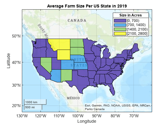
Display the binned average farm size for states in the conterminous US by creating a classification map with a legend.
Set up a topographic map.
figure
geobasemap topographic
hold on
To include each bin in the legend as a separate data series, you must separately plot the states within each bin. For each bin:
Find the indices of the table rows that are associated with the bin.
Extract the rows into a subtable.
Plot the data within the subtable, using the bin as the display name.
for k = 1:n
    idx = statesFarms.BinnedAverageFarmSize == bins(k);
    subT = statesFarms(idx,:);
    geoplot(subT,DisplayName=string(bins(k)))
end
Update the geographic limits to include the region surrounding the conterminous US. Add a title and legend.
geolimits([22 57.5],[-130 -53])
title("Average Farm Size Per US State in 2019")
lgd = legend;
title(lgd,"Size in Acres")
Change the colormap and increase the opacity of the states.
gx = gca;
gx.ColorOrder = parula(n);
alpha(0.75)
Export Map
Export the map to a PNG file.
gx = gca;
exportgraphics(gx,"AverageFarmSizeClassification.png")
References
[1] National Agricultural Statistics Service. “Number of Farms, Land in Farms, and Average Farm Size — States and United States: 2018–2019.” In Farms and Land in Farms 2019 Summary, 6. USDA, February 2020. https://www.nass.usda.gov/Publications/Todays_Reports/reports/fnlo0220.pdf.