Create Custom UI Component with a Chart in App Designer
This example shows how to incorporate a chart into your custom UI component. App creators can use this component to let app users interactively change the display of bubble chart data. The component interface consists of:
Public properties to specify data to plot in the bubble chart, such as
XData,YData, andSizeDataPublic properties to configure the bubble chart display, such as
XLabel,YLabel, andShowLegendPublic properties to configure the user interface controls, such as
ShowSizeUIandShowTransparencyUIPublic callbacks
BubbleSizeChangedFcnandBubbleTransparencyChangedFcnthat execute when an app user interacts with the size and transparency controls in an app
To explore the custom component code, open the InteractiveBubbleChart.mlapp file in App Designer.
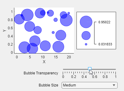
To verify the custom component behavior, first open a new script file and create some random data to plot.
x = 1:20;
y = rand(1,20);
bsize = rand(1,20);
Add this code to create an InteractiveBubbleChart object programmatically and specify the data-related public properties as name-value arguments.
comp = InteractiveBubbleChart(XData=x,YData=y,SizeData=bsize);
Update the component to show a legend for the plot, and define a callback function that hides the legend when the bubble sizes are large by adding this code to the file. Run the code and interact with the component to see the behavior.
comp.ShowLegend = true;
comp.BubbleSizeChangedFcn = @toggleLegend;
function toggleLegend(src,event)
    if src.BubbleSize == "Large"
        src.ShowLegend = false;
    else
        src.ShowLegend = true;
    end
end